

What colour are you?
There is a moment in every great interior when a room stops being a collection of furniture and finishes and becomes something else entirely, something felt rather than simply seen. That transformation begins with colour.
It begins with the audacious decision to pair cinnamon warmth against the cool quiet of dusty blue, letting two opposing forces find their balance the way a good conversation does, each one made richer by the presence of the other. It begins with the courage to bring olive green and deep crimson into the same room and watch them ignite, earthy and bold, unapologetic in their hunger for depth and drama.
It is there in the golden amber of ochre softening into muted rose, a palette so generous and unhurried it feels like being wrapped in something you never want to take off. It arrives with the electric confidence of teal meeting copper, two materials and two moods reaching across the thermal divide to create something genuinely alive.
…And it whispers in the intimacy of maroon deepening into blush, a combination that turns a room into a retreat and a retreat into a sanctuary.
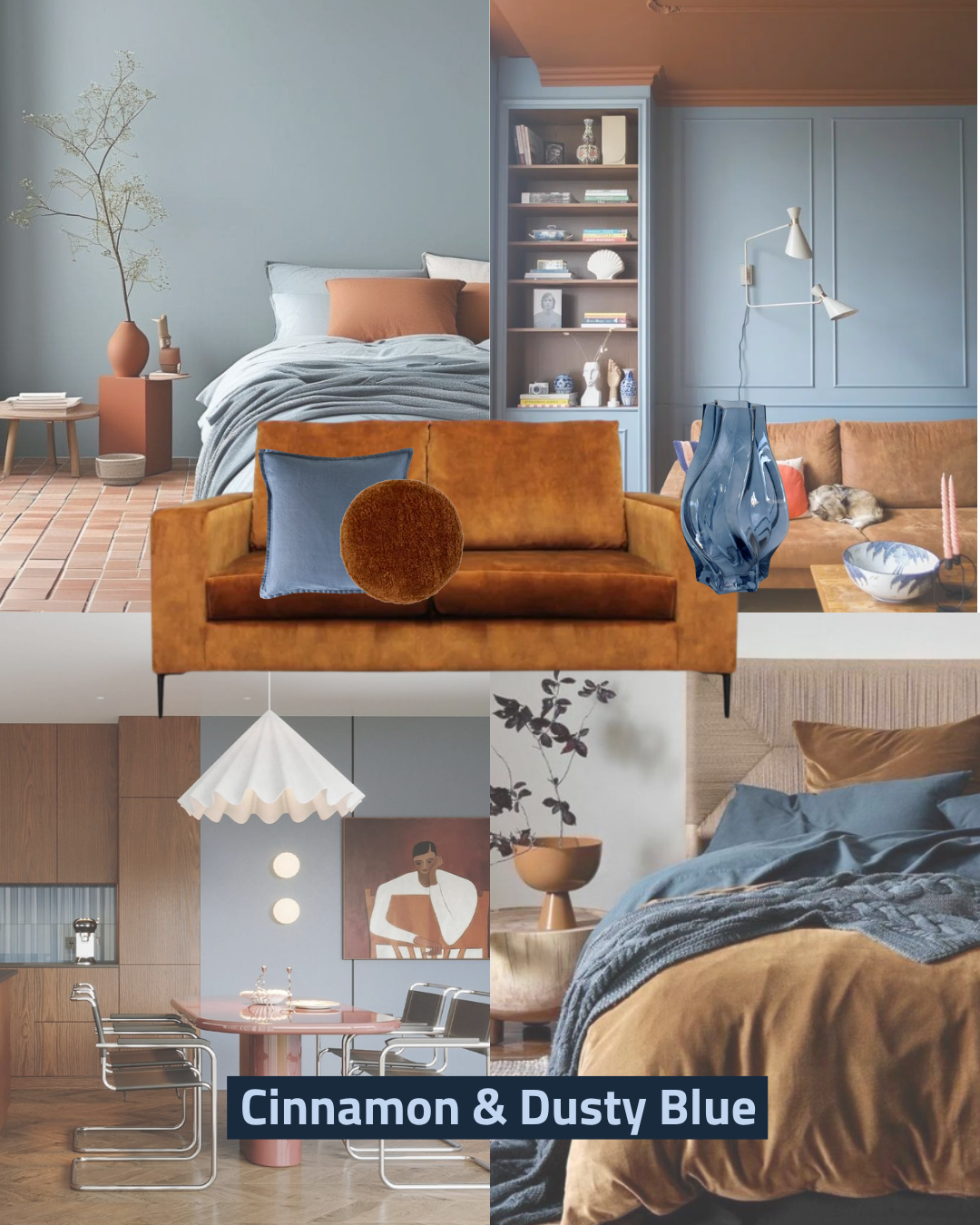
Sophisticated beach vibes
If colours could have a conversation, these two would be the ones lingering longest at the dinner table.
Cinnamon brings the warmth, rich and spiced, settling into burnished leather, terracotta tile, and tactile velvet like it has nowhere better to be. Dusty blue does the opposite: it opens things up, cools things down, and gives every warm surface room to breathe.
The genius of this pairing is that neither colour is fighting for the spotlight. Both have been deliberately quieted, the blue greyed back, the cinnamon deepened, so they can coexist in the most satisfying kind of equilibrium.
Throw in the crinkled linen and rough terracotta textures and you have a scheme that feels lived-in, layered, and effortlessly chic.
The vibe?
Warm in winter, cool in summer, and sophisticated every single day in between.
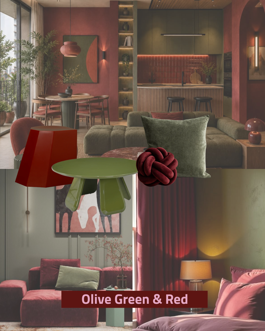
Dynamic, deep and complementary
This is not a palette for the faint-hearted… and we absolutely love it for that.
Olive and red are near-opposites on the colour wheel, and when you push them both into their earthier, moodier registers, something genuinely exciting happens. The olive anchors everything with a sense of permanence and botanical depth, while the red ranges from warm brick to deep burgundy, injecting life into the scheme without ever tipping into chaos.
Warm amber lighting is doing the heavy lifting here, softening the intensity and giving every surface that gorgeous, almost cinematic glow.
Boucle, velvet, lacquered finishes, and slatted timber all share the frame, keeping your eye moving. Bold, layered, and unapologetically maximal, this is a palette for people who want their home to feel like a whole experience.
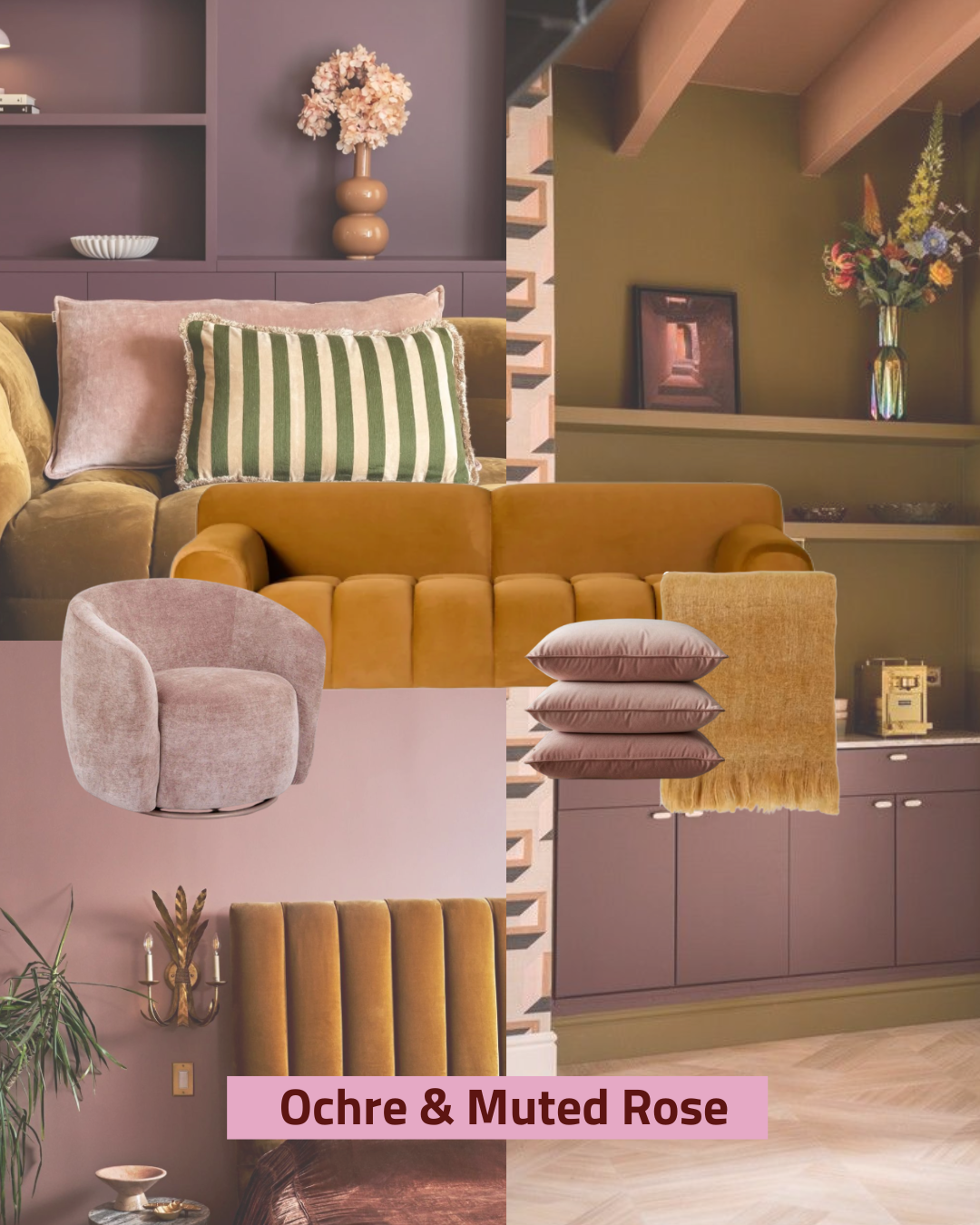
Earthy yellows with a little champaign
Consider this the colour equivalent of a very long hug. Ochre brings a rich, golden warmth that settles over tufted sofas and velvet throws like afternoon light through good curtains, while the muted rose steps in as a dusty mauve-pink so sophisticated it reads as a warm neutral rather than an accent.
A quiet sage green plays third wheel in the best possible way, adding just enough cool contrast to keep the whole thing from feeling too sweet.
This is autumn in a palette: plush, generous, and utterly cosy without trying too hard. The textures are deeply tactile throughout, chenille, velvet, woven fabric, all catching warm ambient light in ways that make the room feel genuinely lived-in.
The vibe is nostalgic and indulgent, a space that whispers "stay a little longer."
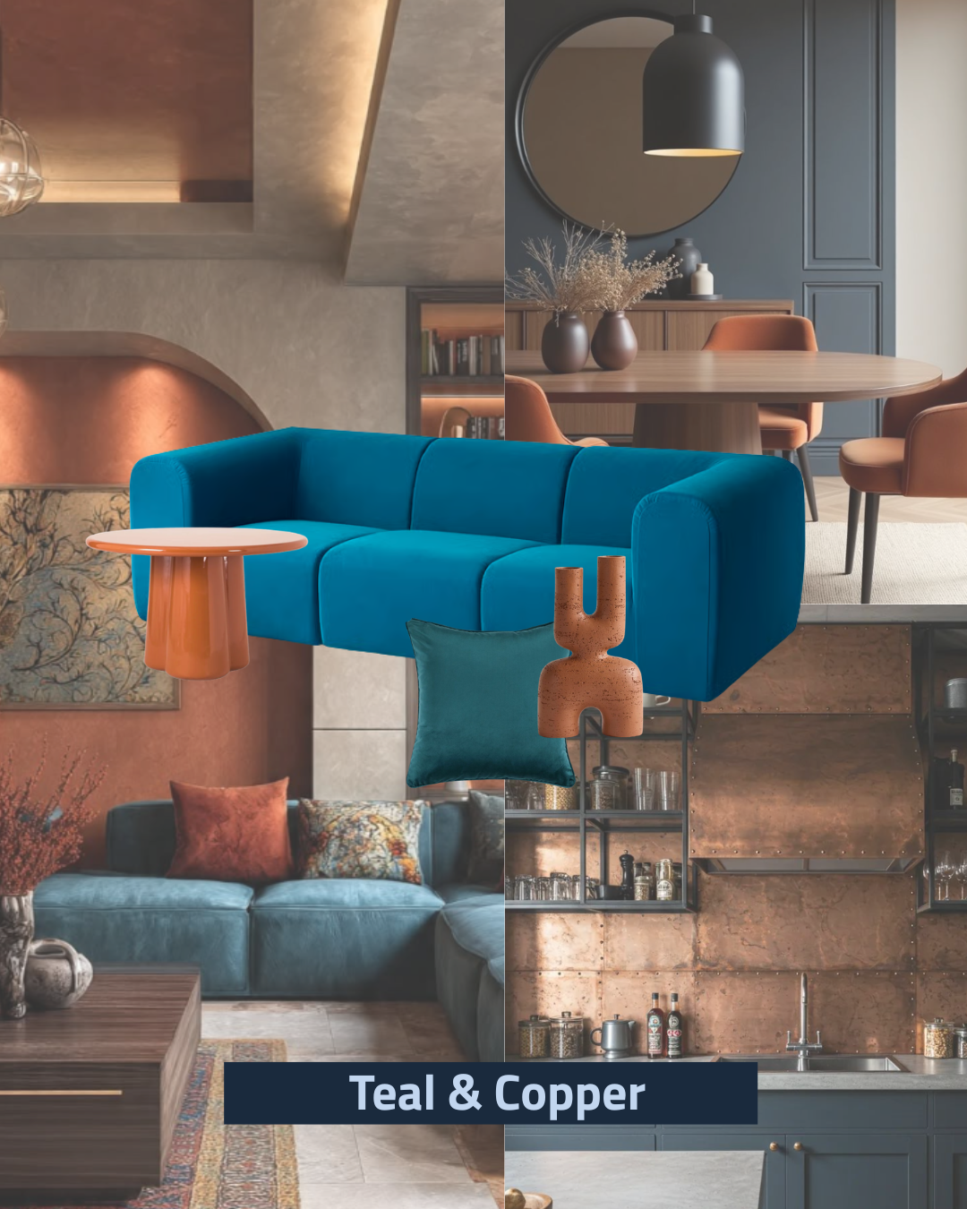
Rusty warmth and calming blues
Few combinations carry this much visual electricity, and this mood board shows exactly why we keep coming back to it.
Teal straddles cool and warm, saturated enough to hold its own against complex backdrops, while copper brings raw, oxidised warmth that feels more like a material than just a colour.
That distinction matters: here, copper shows up as aged sheeting, handcrafted ceramics, and glazed terracotta, giving the palette real artisanal credibility rather than just a trend moment.
Arched alcoves, layered wall textures, and directional warm lighting carve shadows and highlights across every surface, making the copper tones absolutely sing. The result is rich, adventurous, and gallery-worthy.
This is a scheme for the client who wants their home to start a conversation.
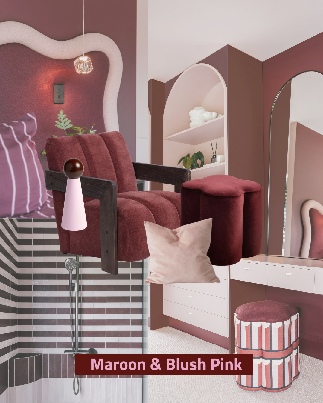
Deep warm rouges and a splash of pink
This is what happens when pink grows up and gets interesting.
Maroon brings serious depth and drama, grounding the scheme so completely that the blush beside it reads as sophisticated and intimate rather than soft or sweet.
Together they create something genuinely cocooning, a palette that makes bedrooms, bathrooms, and dressing rooms feel like proper retreats rather than just rooms you pass through.
Curved forms everywhere, organic wall panelling, arched mirrors, barrel chairs, reinforce the softness and make the whole scheme feel cohesive and considered. Ribbed velvet, striped fabric, smooth tile, and plaster-effect walls layer up the texture beautifully, and the warm amber lighting ties it all together in the most flattering way imaginable. Indulgent, theatrical, deeply personal.
This one is for the people who know exactly who they are.
