

Hot Takes as Women in Design
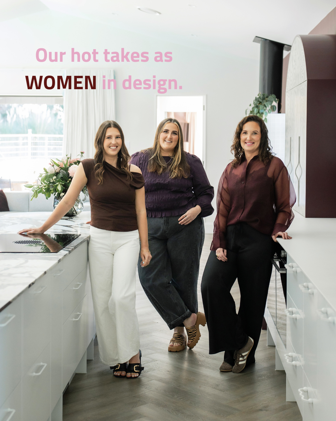
We have opinions.
Strong ones.
The kind that get raised at design reviews, debated over coffee, and occasionally scrawled on sticky notes that end up on the studio wall. As women who got into this industry because we genuinely believe that the spaces people live in have the power to change how they feel about their lives. Not just aesthetically. Emotionally. The right room can make you braver, softer, more yourself. And that is not something you get by playing it safe.
So when we see a beautiful space get watered down into something inoffensive, or a client talked out of the wallpaper they fell in love with, or another kitchen finished in the same matte black fixtures as the last ten kitchens, we feel it. Because every one of those decisions is a missed opportunity to create something that actually matters to the person living in it.
This is our hot takes series. It is not here to be controversial for the sake of it. It is here because we think the design industry deserves an honest conversation, and because the women of EBD are not in the business of telling people what they want to hear. We are in the business of designing spaces that feel like coming home to the very best version of your life. That takes courage. It takes conviction. And occasionally, it takes being willing to say the quiet part loud.
Welcome to how we think.
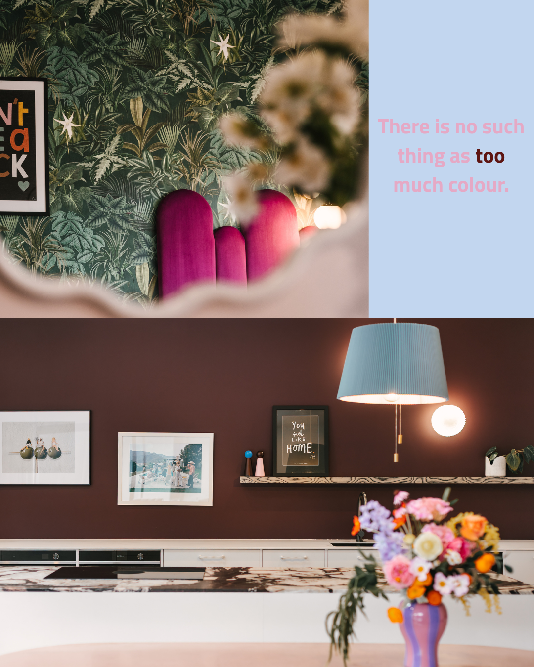
Over-saturation is a myth!
Here it is, the evidence.
A botanical wallpaper so lush it practically breathes, paired with a magenta velvet headboard that refuses to apologise, and then a kitchen wrapped in the deepest, richest aubergine you have ever seen anchored by a dusty blue lamp shade and a vase of wildly joyful flowers.
This is what happens when someone makes a decision and commits to it fully, without hedging, without reaching for a neutral to "balance things out."
The balance is the colour.
The joy is the point.
Every person who has ever been talked out of the wallpaper they loved should be sent this image immediately.
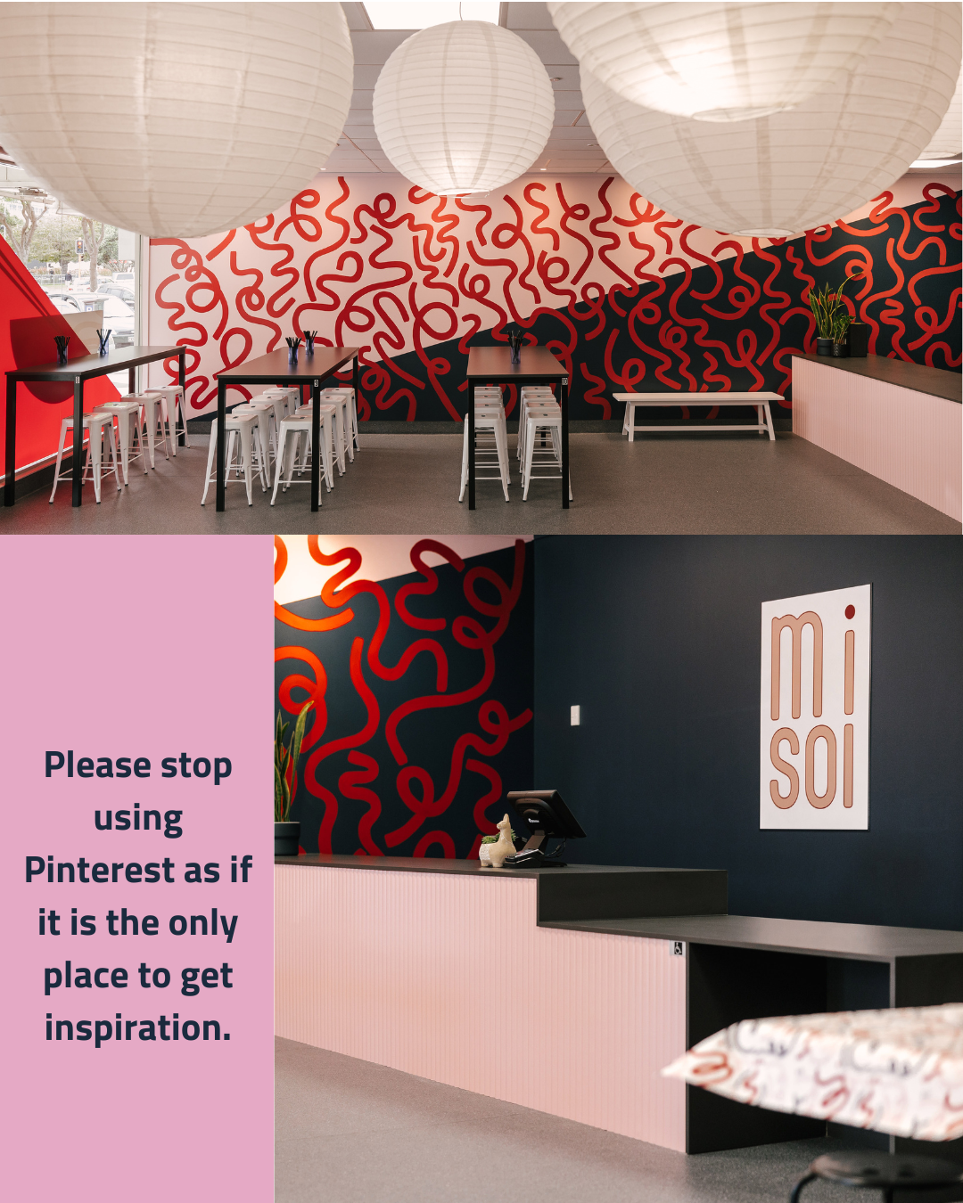
The brief is the inspiration…
This is what inspiration looks like when it comes from somewhere unexpected.
The Misoi space takes midnight navy and wraps it in a hand-painted mural of swirling red and orange loops that feel like pure energy caught mid-motion, then softens the whole thing with paper lanterns and blush reception panels that nobody saw coming.
You will not find this combination on a Pinterest board because nobody had thought to put it there yet.
That is exactly the point. The best interiors do not follow the algorithm, they write their own brief, and then they execute it with absolute conviction.
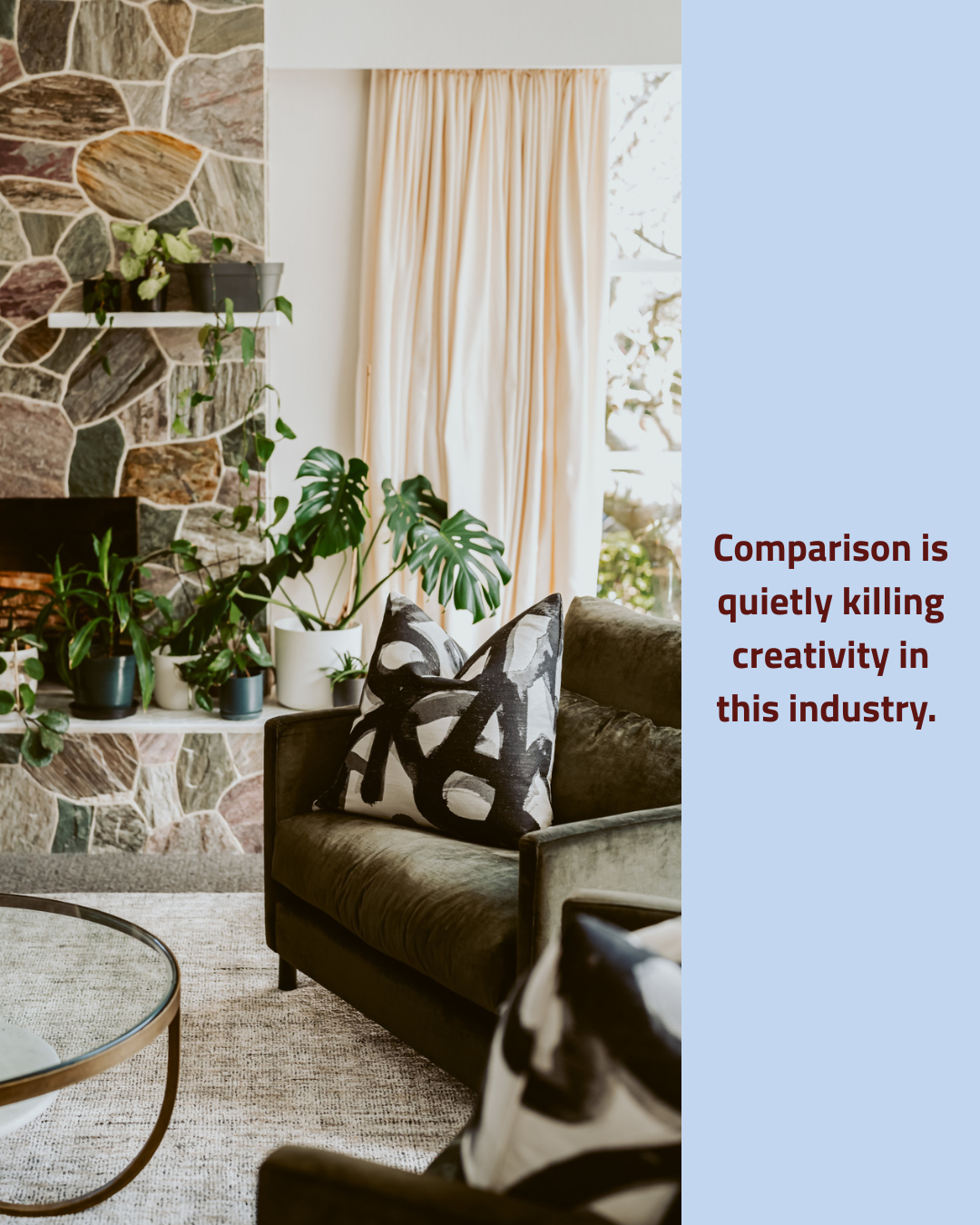
Let your creativity do the talking
This room does not care what anyone else is doing and you can feel it.
A rough-hewn stone fireplace towers beside the softest linen curtains, while a forest green velvet armchair sits grounded and unrushed in the middle of it all. The abstract cushion is the room's little punctuation mark, graphic and confident.
Nothing here was chosen because it was trending.
Everything here was chosen because it belongs, because it earns its place in the room, and because someone had the creative courage to look at a stone wall and think "yes, and then velvet."
That is what originality actually looks like.
Make space for treasures, they are the spice of life!
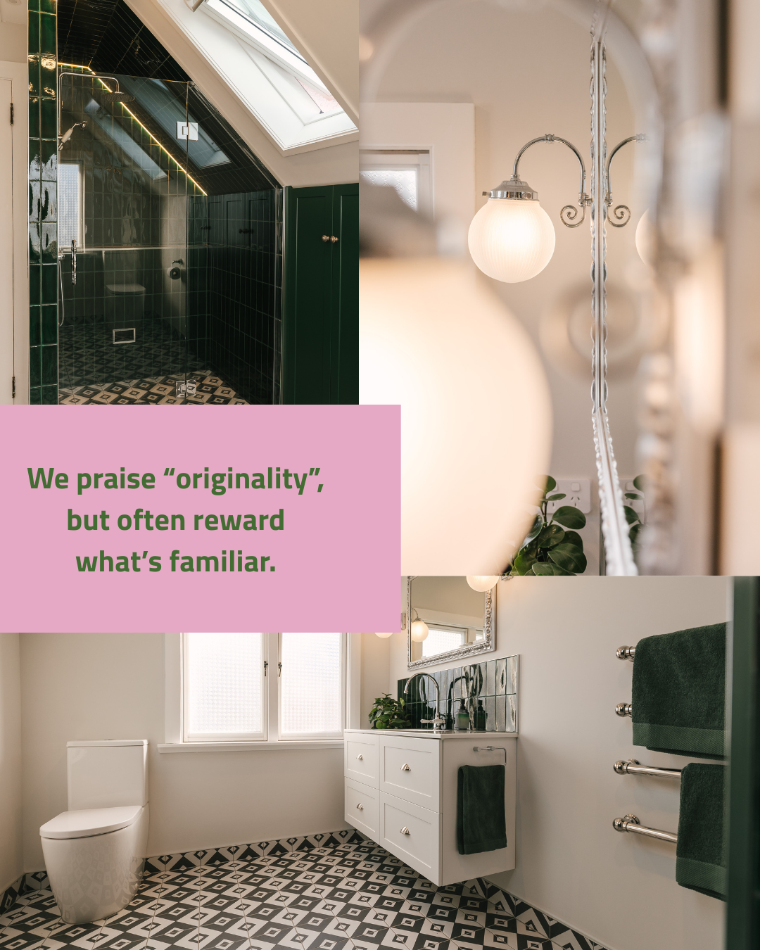
The emerald green bathroom does not ask for your permission and we respect it enormously.
Floor to ceiling in deep bottle green tile, it turns the shower into something that feels genuinely dramatic, almost like stepping into a jewellery box.
Paired with the black and white geometric floor tile, the whole thing walks the line between bold and classic with a confidence that most bathrooms never get close to and then the other half of the bathroom, white cabinetry and chrome, acts as a counter balance the rich depth of colour and textures.
Working out that balance and how to do it right is a fine art but so rewarding when it works that well!
Make space for treasures, they are the spice of life!
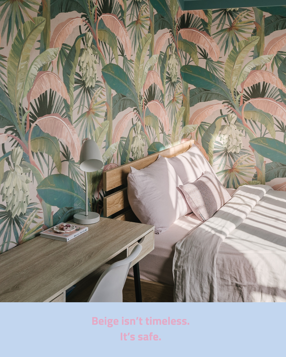
A bedroom wrapped entirely in a tropical banana leaf wallpaper, all blush pinks and sage greens and the kind of lush abundance that makes you feel like you are waking up somewhere extraordinary.
And what did the rest of the room do in response?
It stayed warm, stayed simple, let the wallpaper have its moment completely.
Timber, linen, a small desk lamp doing exactly what it needs to do.
The wallpaper is not the risk here.
Choosing bare beige walls over something that makes you genuinely happy every single morning is the actual risk.
Beige does not age better than colour.
It just offends fewer people in the short term.
Lean into creativity, not the price-tag
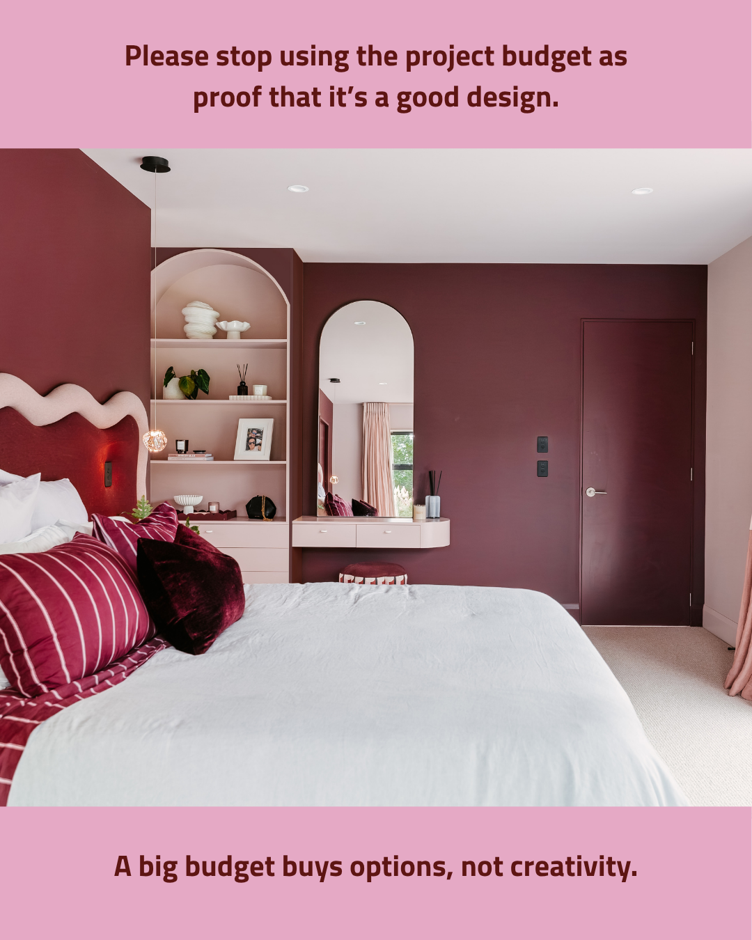
This room is the argument.
Deep mauve walls, a wavy sculptural headboard, blush arched shelving built to display life rather than hide it, and crimson bedding that leans into the whole palette with complete confidence.
None of the decisions here require a large budget.
They require a point of view.
The arch detail costs the same as a square one.
The paint is paint.
The choice to commit to a colour story from the walls to the textiles to the joinery, that is what good design is made of, and it is completely free.
Follow the experience, not the trends
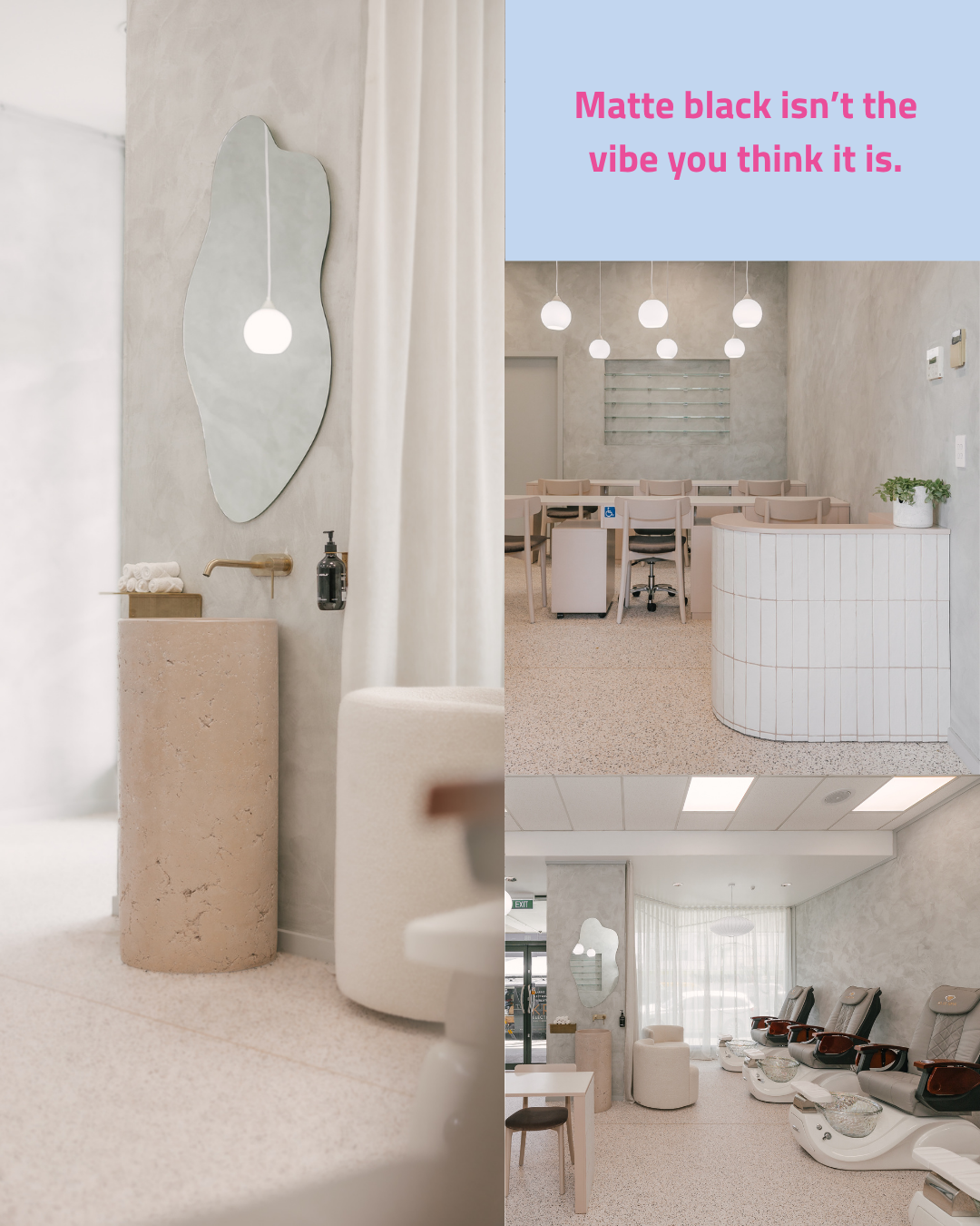
Here is the counter proposal: travertine.
An organic pedestal basin in raw, veined stone, a leaf-shaped mirror, brass tapware, and a palette so quiet it makes you exhale.
The nail salon spaces beside it take that same restrained confidence further, curved joinery in warm white, terrazzo underfoot, globe pendants that glow rather than perform.
Not a single matte black fixture in sight … and the spaces are more considered, more interesting, and more genuinely beautiful for its absence.
Sometimes the most sophisticated thing a room can do is choose warmth over the finish that everyone thought was edgy four years ago.
