

Unpopular Design Opinions
Grab a cushion, preferably one with a decent inner, because we're about to ruffle a few feathers.
After years of designing, building and living in the real world, our team has collected a few opinions that don't always go down well at dinner parties. We've side-eyed matching furniture sets and quietly mourned yet another quadrant shower. We've also had the "do we really need more windows?" debate more times than we can count.
None of this is about being difficult. It's about designing homes that feel personal, work beautifully and still make sense ten years from now, not just on handover day.
So here they are, our honest hot takes. You might nod along, you might clutch your pearls.
Either way, we'd love to know which ones you agree with.
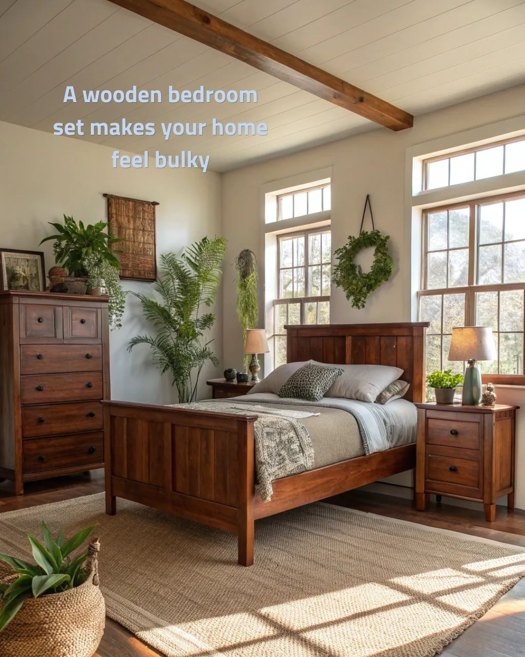
Just like anything, too much timber can be overwhelming…
When every piece is the same timber, tone and heavy silhouette, the room reads as one big brown block.
There's no contrast,
no breathing room
and nowhere for the eye to rest.
Today's best bedrooms feel collected rather than bought in one go. Try an upholstered or linen bed with a timber bedside, a stone or rattan side table, or a lighter dresser raised on legs so you can see floor underneath.
Mixing materials and visual weight lets each piece shine, and the room instantly feels lighter, larger and far more personal.
Love timber?
Keep it,
just don't let it all match.
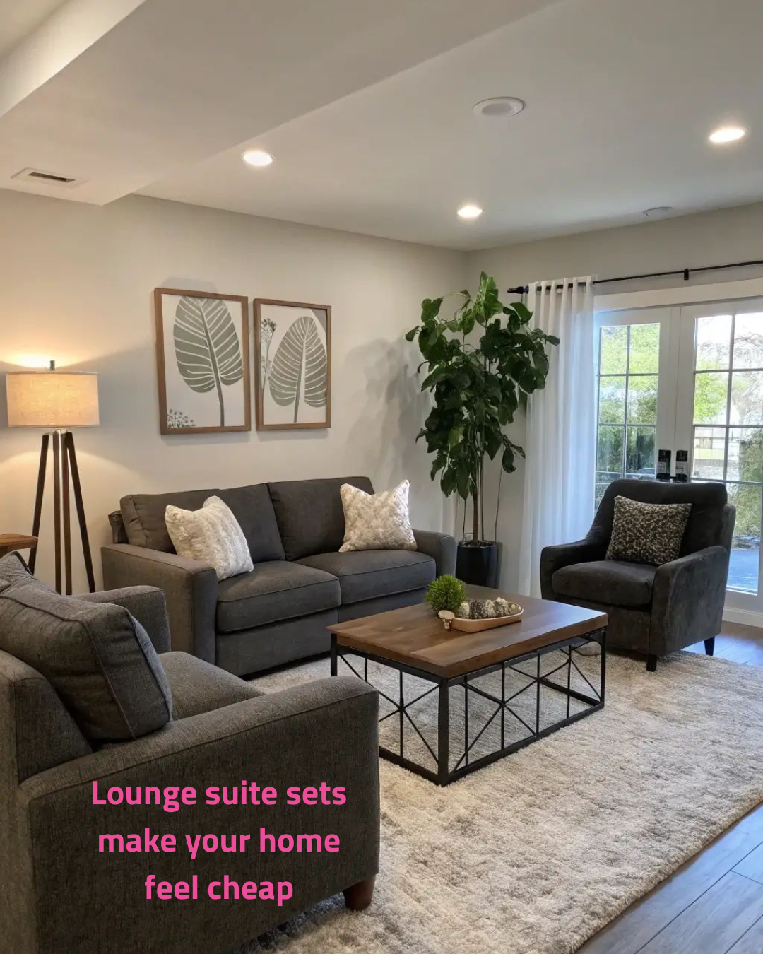
Variety in your furniture shows your personality!
Nothing says "showroom floor" quite like a sofa and two armchairs in the exact same fabric.
Matching sets flatten a room,
with one colour,
one texture and one shape repeated on loop.
A curated lounge mixes a hero sofa with contrasting occasional chairs: a sculptural shape, a leather or bouclé texture, a different scale.
That variety creates depth and conversation, and makes the space look designed rather than delivered. It's also a smarter way to spend.
Invest in the sofa you'll sit on every day, then have fun with the pieces around it.
Simple planning saves lives…and your budget!
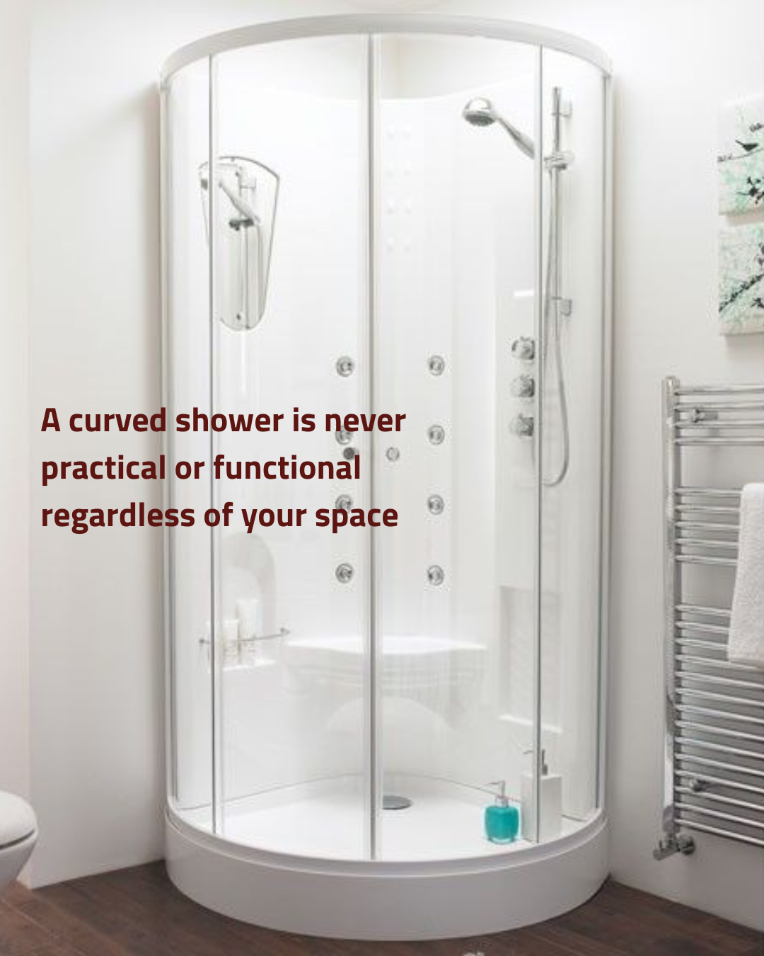
Curved showers were sold as space savers
but
they rarely save anything…
The curve leaves awkward dead corners, curved glass is costly to replace, and those sliding tracks and seals are magnets for grime.
Architecturally, a straight frameless panel or a walk-in shower with a linear drain is simply better planning.
You get continuous tiling, clear sightlines that make the bathroom feel bigger, easier cleaning, and a level-entry option that suits every stage of life.
Clean lines do the hard work here, and they'll still look right in twenty years.
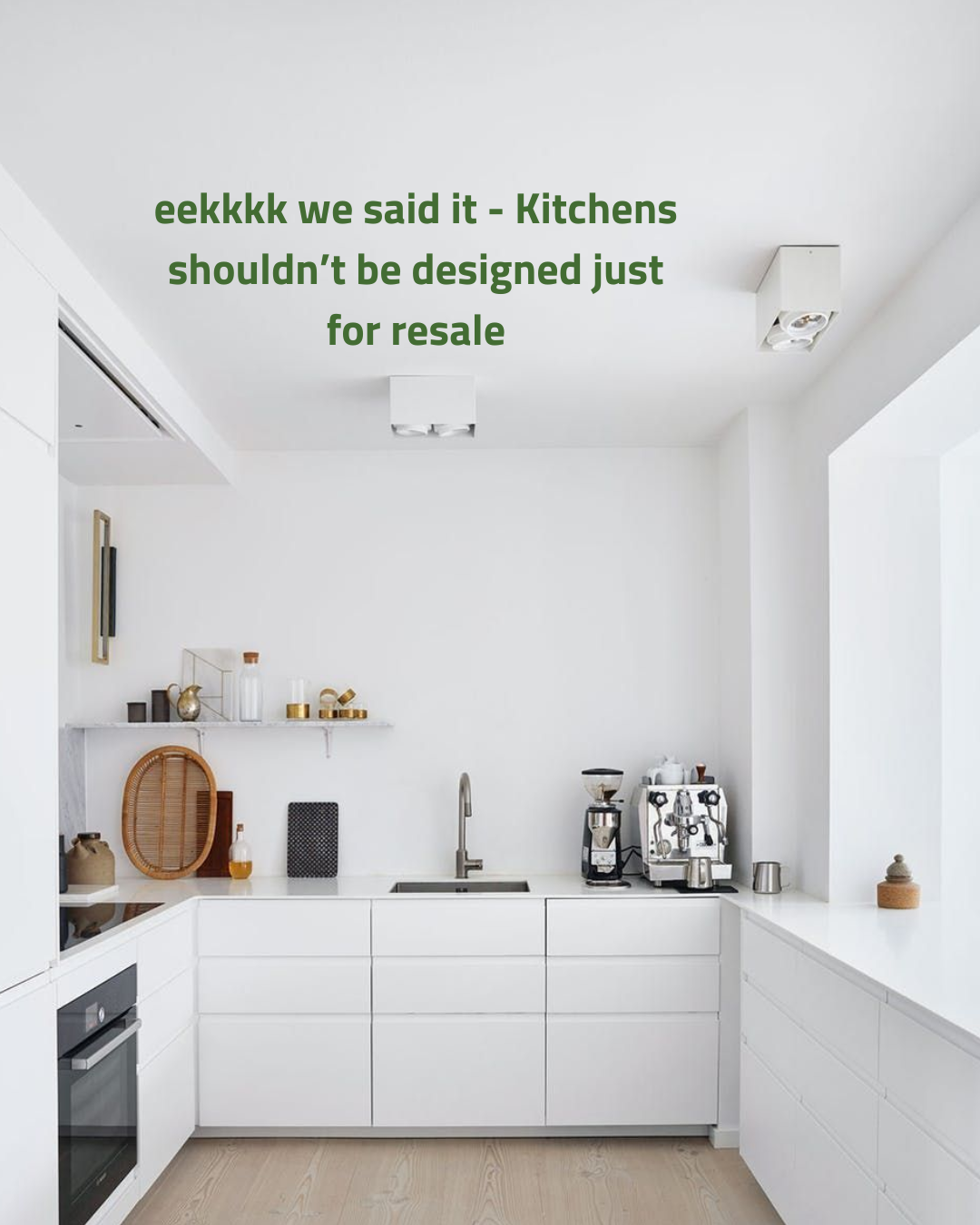
Not making a choice can be just as costly as bad ones
Designing for an imaginary future buyer is how you end up with a kitchen nobody loves, including you.
You're the one cooking in it every day for the next ten years, so it should work for how you live: storage where you actually reach, a layout that suits your workflow, and finishes that make you happy at 7am.
Buyers don't respond to bland.
They respond to quality,
considered planning and good craftsmanship.
A well-designed kitchen with personality still adds value. It just adds a lot more joy along the way.
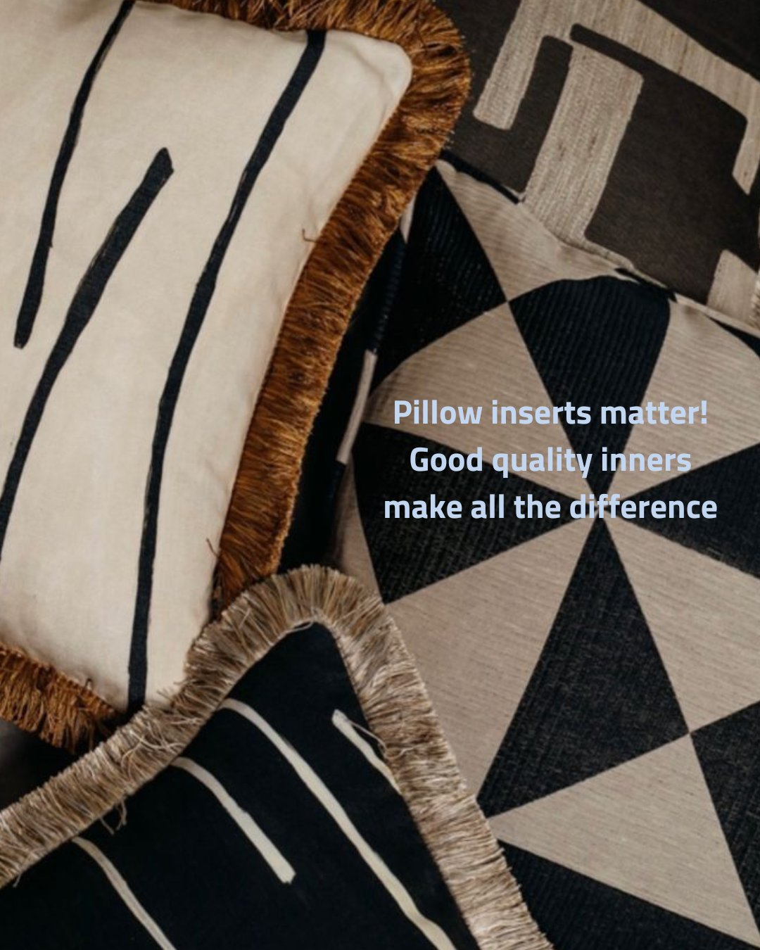
What’s inside matters too!
You can have the most beautiful cushion cover in the world, but put a flat polyester inner inside and…it'll sag like a deflated balloon…not ideal!
A feather or feather-blend inner gives you that plump, relaxed shape and the satisfying "chop" stylists love.
Our trade secret is to size up your inner by around 5cm so the cover sits full and generous.
Good inners hold their shape for years, so they're the more sustainable choice too.
A budget cover with a great inner will always beat an expensive cover with a cheap one.
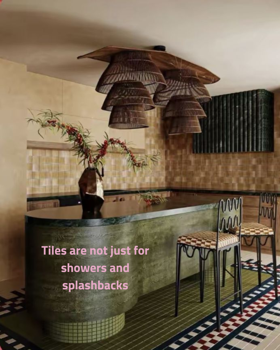
Tiles deserve a bit more airtime
Tiles are having a real moment, and designers are taking them everywhere: island fronts, kitchen plinths, fireplaces, joinery, even furniture.
They're incredibly durable, easy to clean and bring colour, pattern and texture in a way paint simply can't.
Small mosaics and finger tiles wrap beautifully around curves, and a patterned tiled border on a floor can define a zone without building a single wall.
Glazes like zellige catch the light and add handmade character.
Think of tile as a design material, not just a waterproofing one, and suddenly every surface becomes an opportunity.
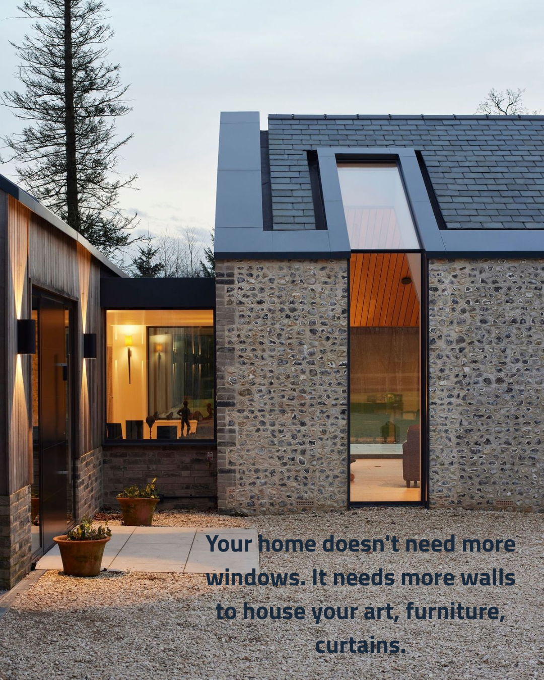
Windows with intention beats windows everywhere
More glass isn't always better.
Glazing is still the weakest thermal part of your home's envelope, so too much of it means overheating in summer, heat loss in winter, glare and privacy issues. And…
with ever-higher energy efficiency standards, every window has to earn its place.
Fewer, more considered openings frame a view like a piece of art and make the moment of looking out feel special.
Solid walls give you somewhere to hang art, place a sofa, and layer in curtains and lighting.
Good architecture is as much about what you hold back as what you open up.
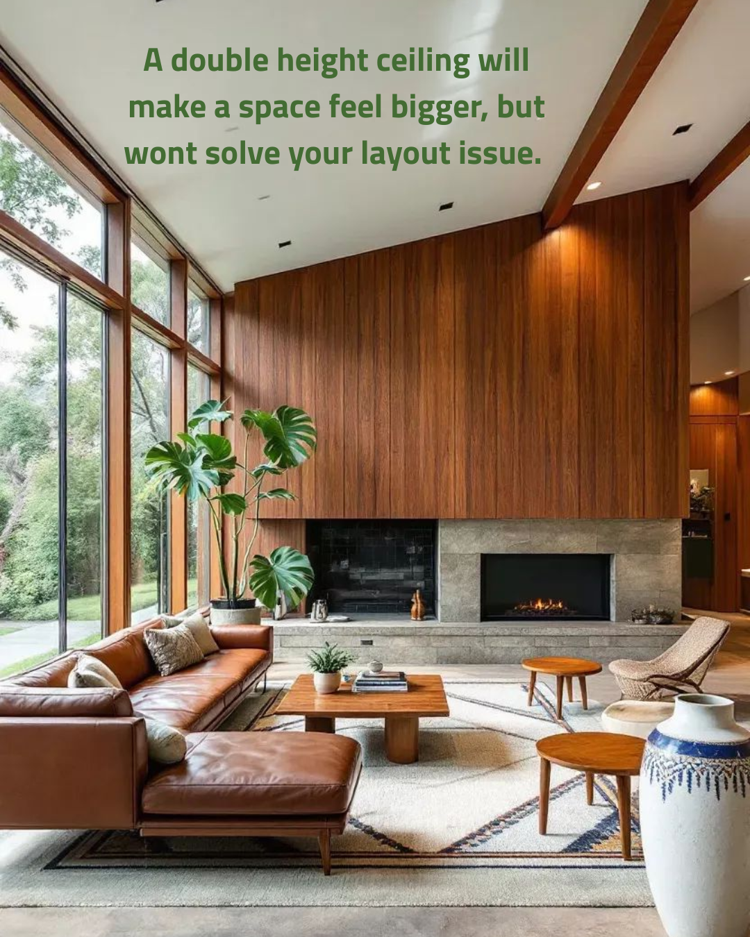
Layout matters more than bigger spaces…
Volume is wonderful, but it's not a fix for poor planning.
If the circulation is awkward…
The furniture has nowhere to go…
Or the kitchen is in the wrong spot, a soaring ceiling just makes the problem taller!
Big volumes can also feel cavernous, echo, and cost more to heat, since warmth rises straight past you. Great spaces are built on human scale, with good flow, clear zones and furniture that anchors the room.
Get the layout right first.
Then add height where it creates a moment, not to cover a mistake.
