

Butterfly Compassion Community (BCC) came to us with an ambitious vision: create more welcoming support for neurodivergent children and the people around them. Across education, mobile sensory experiences and a permanent community space, the Awhi projects each needed a clear identity of their own.
Our role was to turn that vision into tangible design elements: a family of logos that feels connected, works in different settings and helps people tell the four Awhi divisions apart.




At the heart of the identity is a child-shaped icon. Their head and body are formed from one big scribble: a playful visual metaphor for a neurodivergent brain, full of movement, ideas and its own way of making sense of the world. The friendly character is designed to appeal to children while giving the wider Awhi brand a memorable, recognisable mark.
From that starting point, we created distinct logos for Awhi Rise, Awhi Mini on Wheels, Awhi on Wheels and Awhi Connect. Each has its own personality and purpose, while the shared visual language brings them together as parts of one wider Awhi kaupapa.
Because the branding was developing alongside the Awhi spaces, it was important for the visual language to feel consistent across both. The identity and the environments could then support the same welcoming experience, from the first impression of a logo to the details children encounter inside a sensory space.
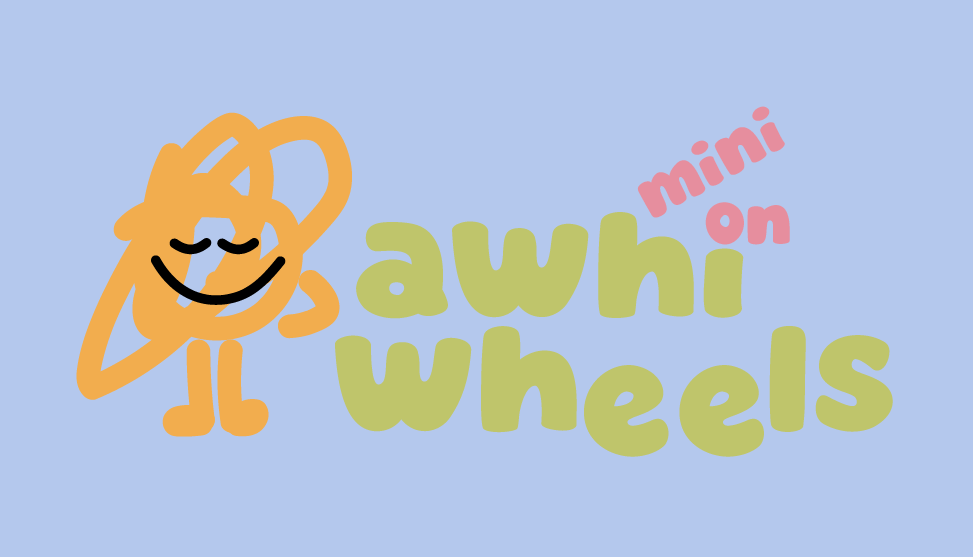
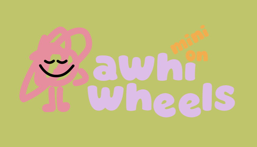
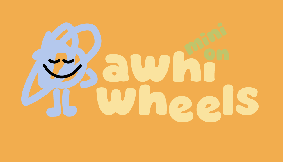
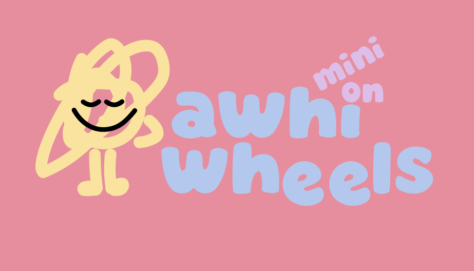
Awhi Rise is BCC’s education programme, created to help school communities better understand and support neurodivergent students. Awhi Mini on Wheels brings sensory experiences to rural schools in a compact caravan. Awhi on Wheels takes that experience to schools across the region by bus. And Awhi Connect is the permanent sensory space: a place for families, schools and the wider community to come together.
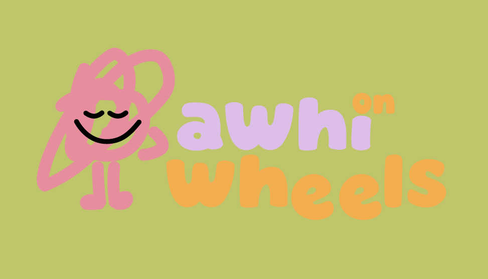
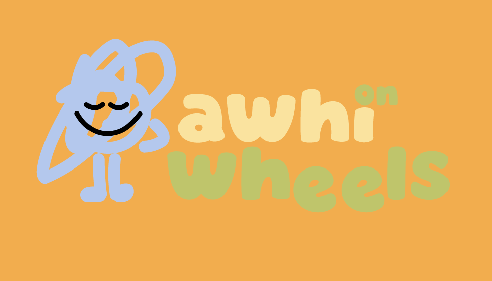
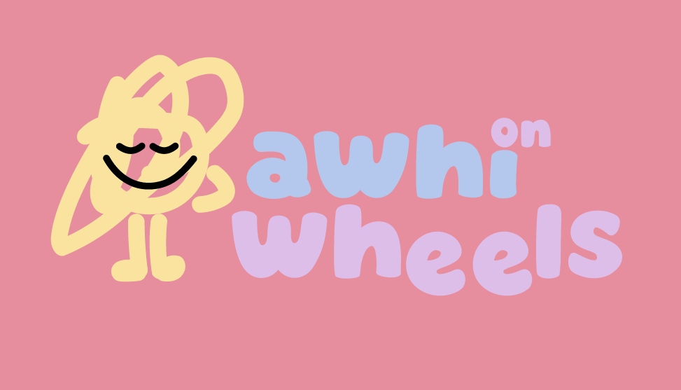
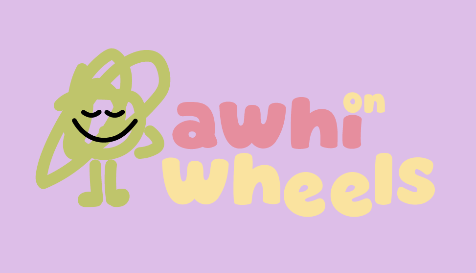
The logos were designed to be used in more than one way, so the identity can stay fresh and engaging across different touchpoints. A flexible icon can stand on its own where a full logo won’t fit, while the individual division marks make each project easy to recognise. A warm, varied palette adds energy and gives the wider brand room to adapt.
The result is a logo family that gives each Awhi division its own face, while keeping them connected to a shared purpose: creating more understanding, access and support for neurodivergent children and their communities.
We’re proud to have helped BCC bring this vision to life through design.
