


We know, we know.
Someone’s grandmother just gasped.
For generations, we’ve been taught that a well-designed room means everything comes in pairs, lined up and perfectly mirrored…
And sometimes that’s exactly right.
Formal dining rooms, grand entries and traditional bedrooms often love a bit of symmetry.
But in most homes, especially the relaxed, lived-in spaces we design for, perfect symmetry can feel a little too rehearsed.
Real life isn’t symmetrical.
Windows sit off-centre, doors interrupt walls, and the best spot for the sofa isn’t always the middle.
The secret isn’t ditching symmetry altogether.
It’s knowing when it’s working for you, and when it’s just habit.
Once you understand why balance matters, you can create it in far more interesting ways.
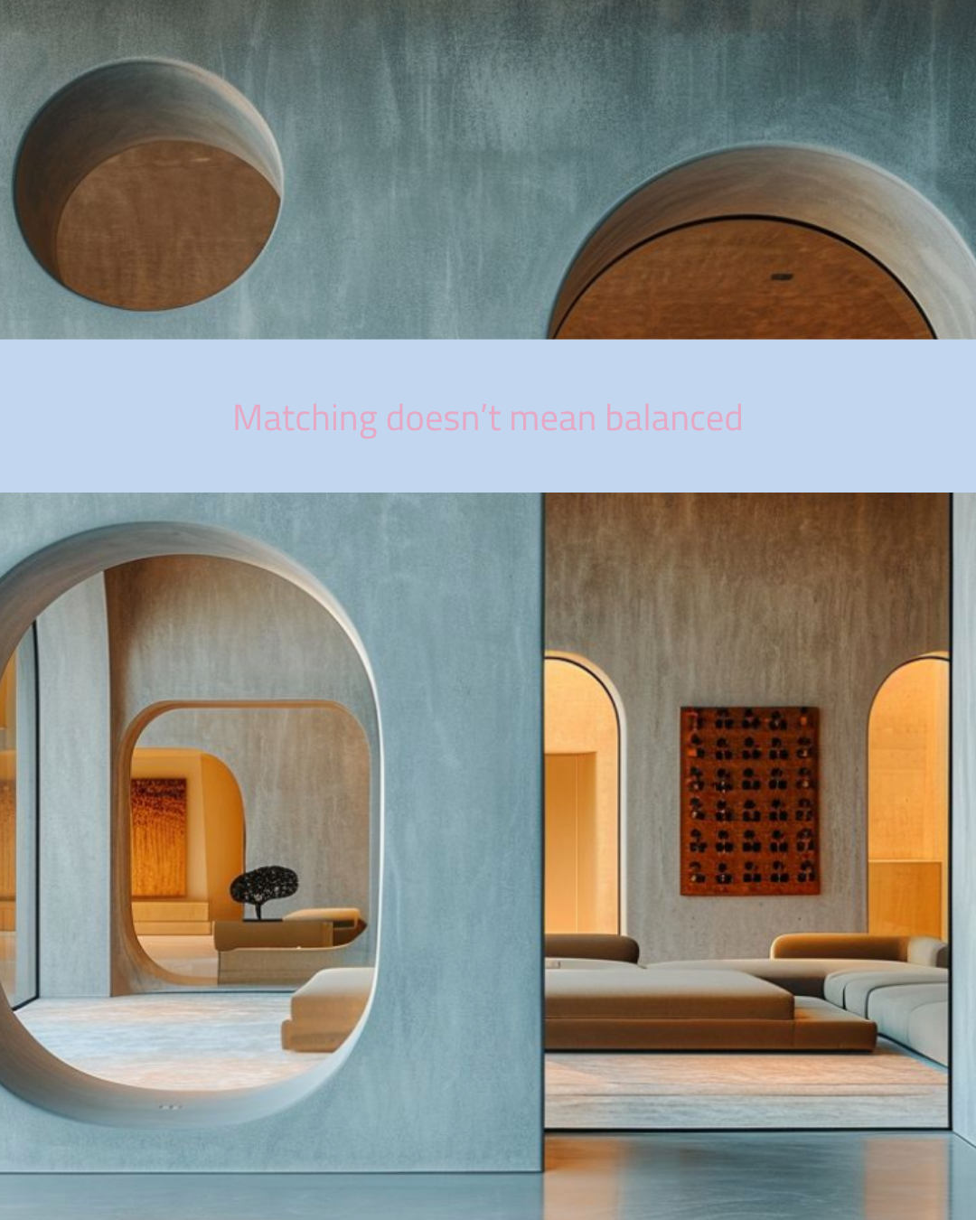
Matching doesn’t mean balanced
Balance is about how a space feels, not whether every element is identical.
Look at these sculpted openings.
A circle, an arch, a soft pill shape, all different sizes, all in different positions, and yet the wall feels completely resolved.
That’s because they share a language.
The same curves, the same plaster finish and the same warm glow behind them tie everything together.
Architects call this rhythm, and it’s often more powerful than repetition.
When every opening matches, your eye scans once and moves on.
When they vary, your eye travels, discovers and lingers.
The cool grey plaster against those amber interiors adds another layer of contrast.
It’s a great reminder that balance comes from relationships between elements, not from making them all the same.
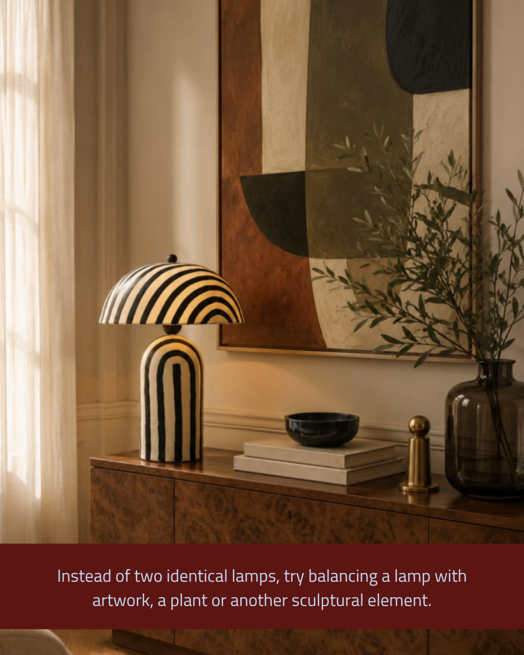
Instead of two identical lamps, try balancing a lamp with artwork, a plant or another sculptural element
The classic “lamp on each end” sideboard is safe, but it rarely sparks joy.
Here, one statement lamp holds the left side, while the large artwork, the olive branches and the smoky glass vase balance the right.
Nothing matches, yet nothing feels lopsided.
That’s because each element carries a similar amount of visual weight.
A bold striped lamp is visually heavy, so it needs something equally strong to answer it, and the tall greenery and artwork do exactly that.
Stacked books, a sculptural bowl and a brass object then fill the middle with smaller moments.
This approach also lets each piece shine on its own rather than being part of a pair.
Think of styling as a conversation, not a mirror. Each piece should respond to the one beside it.
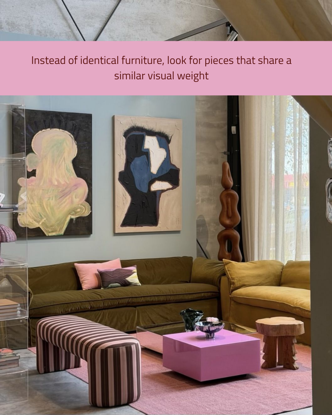
Instead of identical furniture, look for pieces that share a similar visual weight
Visual weight is one of those design terms that sounds technical but is really about instinct.
It’s how heavy or light something feels to the eye, based on its size, colour, texture and form.
In this room, an olive sofa sits beside a mustard one.
They’re different colours and different shapes, but both are deep, soft and generous, so they hold the space equally.
A striped bench, a glossy pink cube and a rough timber stool all play different roles.
The tall carved sculpture balances the height of the artwork.
Nothing is a matching pair, but everything feels considered.
This is how you create a room that looks collected over time rather than bought in one trip, and it’s far more fun to live in.
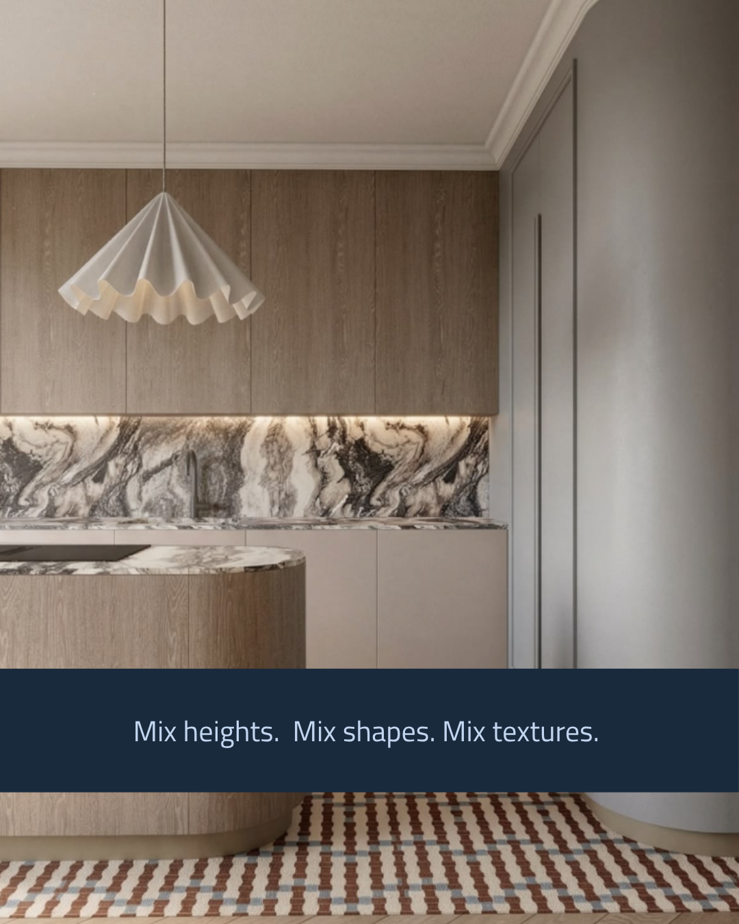
Mix heights. Mix shapes. Mix textures.
If every element in a room sits at the same height, has the same shape and shares the same finish, the space can fall flat fast. This kitchen proves how much variety can do.
A soft ruffled pendant floats above a curved timber island. Behind it, tall straight joinery meets a wildly veined marble splashback, while a curved wall softens the corner.
Lighting tucked under the cabinetry adds another layer.
Then a graphic patterned rug grounds the whole scene.
Every material and form plays a different role, but the palette of warm timber, soft stone and warm greys keeps it calm.
That’s the trick. When you vary shape and height, keep something consistent, whether it’s colour, tone or material, so the eye has a thread to follow.
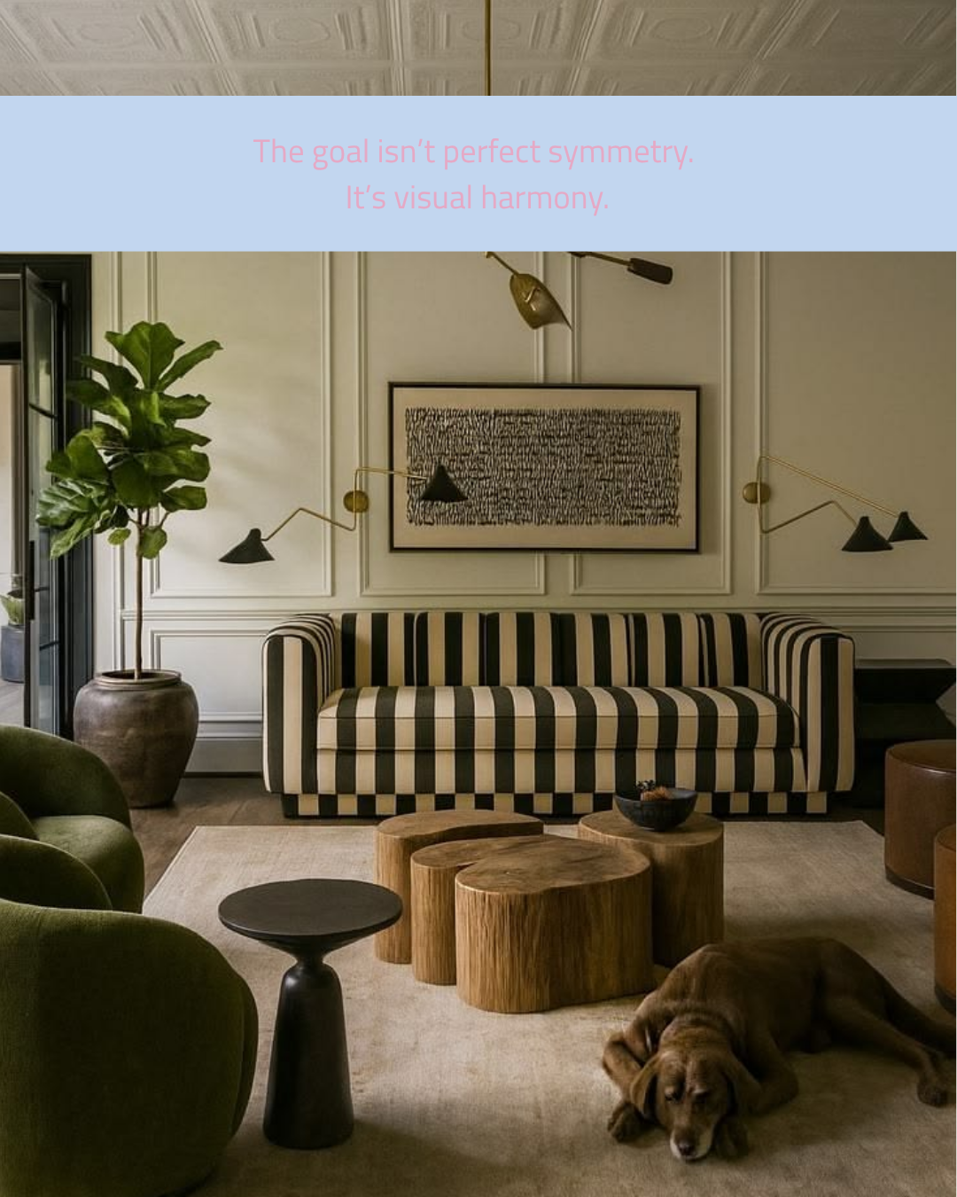
The goal isn’t perfect symmetry. It’s visual harmony.
This room is a masterclass in using symmetry as a backbone, then softening it.
The sofa, artwork and pair of sculptural wall lights are perfectly centred on the panelled wall, which gives the room a strong, calm anchor.
Then everything around it relaxes.
A fiddle-leaf fig rises on one side, curvy green armchairs sit on the other, and organic timber stump tables cluster in the middle like they’ve grown there.
Even the dog has chosen an off-centre spot.
Because the core is ordered, the room can handle all that freedom without feeling messy.
Harmony happens when structure and spontaneity work together.
Start with one symmetrical moment to ground the space, then let the rest of the room breathe.
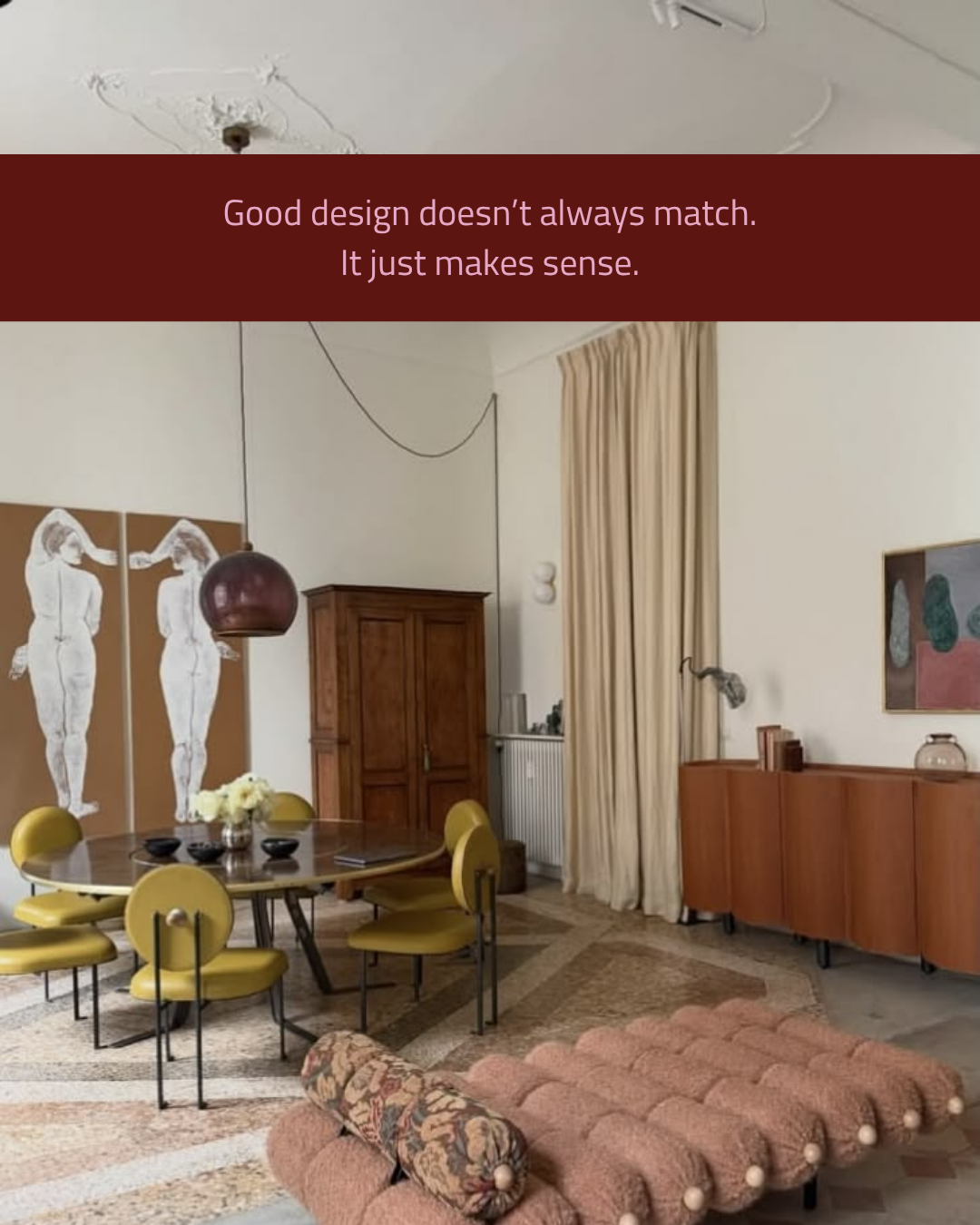
Good design doesn’t always match. It just makes sense.
At first glance, this room breaks almost every rule.
An antique armoire stands near a wavy timber sideboard.
Mustard leather dining chairs circle a round table on a terrazzo floor.
A pink bouclé daybed sits under figurative art.
Nothing matches, and yet it all feels right.
That’s because every decision has a reason.
The warm timber tones repeat across old and new pieces.
Curves appear again and again, in the chairs, the pendant, the sideboard and the daybed.
The tall drapes echo the generous ceiling height. Breaking the rules works best when you understand them first.
Once you know why symmetry creates calm, you can choose when to follow it and when to play.
The result is a home with confidence, character and a story that’s entirely its own.
