

A Sculpted Gathering…. The real insights
Let us tell you all the little behind the scenes
We’ve been banging on about A Sculpted Gathering for a while now... but today we’re letting you in on some of the thinking behind the design.
This project was a little different.
Designing a home for someone you’ve worked alongside for years means Hannah and Sarah already had a pretty good idea of how Emma wanted the house to feel before a brief was ever written.
But this wasn’t a case of designers simply presenting a finished idea and saying, “here you go.”
Emma was part of the design process too.
With her own eye for design, understanding of materials and a clear sense of how she wanted her home to feel, she brought another layer to the conversation. The best projects are always a collaboration — a back and forth of ideas, opinions and those moments where someone says, “wait... what if we did this?”
Hannah and Sarah knew how her family lived, how she entertained, the details she would love and, perhaps more importantly, the things she would probably need a little convincing on.
Because there’s a funny thing about designing your own home...
Even when you know the process, understand the decisions and spend your days helping other people make them, it suddenly feels a lot more personal when it’s your own front door.
And yes... there were a few moments of hesitation.
The biggest one?
The burgundy kitchen.
It was always part of the design. The idea was never in question. But when it came time to actually commit to that much colour, the sample suddenly stopped feeling like a colour on a board and started feeling like a very permanent decision.
We’ve all been there.
The kitchen went in without it, and it was beautiful. But it wasn’t quite complete.
Because sometimes the thing that feels like the biggest risk is actually the thing that brings the whole design together.
After a few well-deserved “we told you so’s”, the burgundy went in exactly where it was always meant to be.
The lesson?
Even people who know and love design sometimes need to trust their designers.
Here’s a look behind the scenes of the choices that make A Sculpted Gathering feel the way it does.
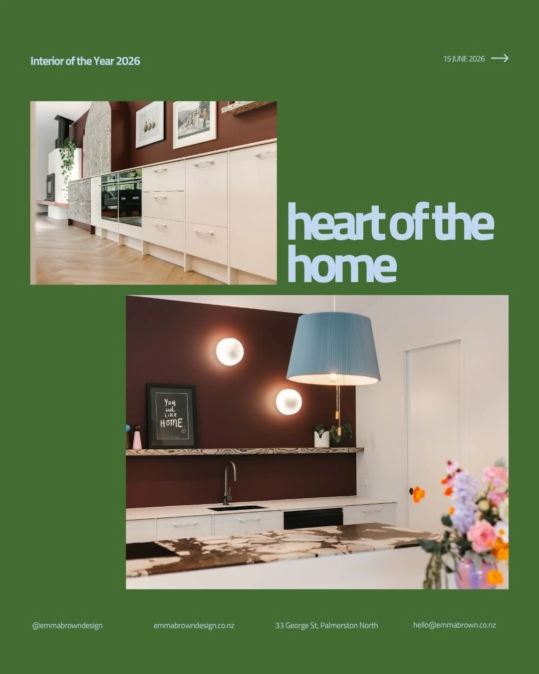
Kitchen: The Heart of the Home
The kitchen was never going to be the quiet one in the corner.
This space was always designed to be the place where everyone ends up. Cooking dinner, pouring drinks, leaning against the island having a chat... you know the drill. Somehow the kitchen becomes the unofficial gathering spot of every home, so we wanted this one to actually earn the title.
The layout connects the living, dining, pool and outdoor entertaining spaces so whoever is cooking is still part of the conversation. Because let’s be honest... nobody wants to design a beautiful kitchen only to create a fancy little room where someone disappears to make snacks.
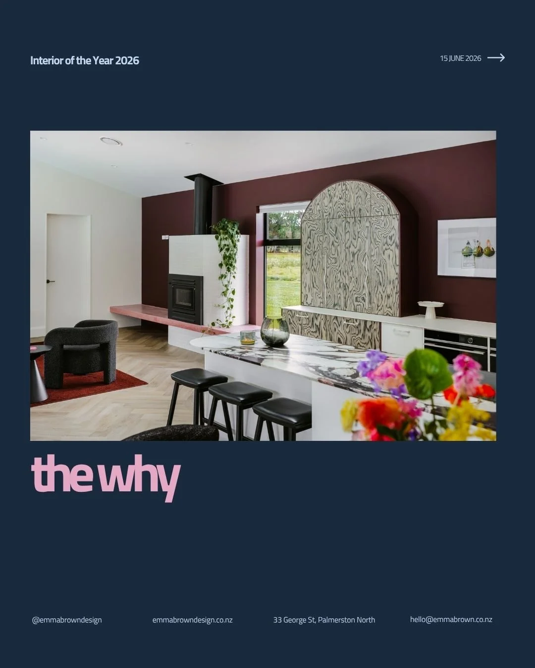
The material choices were where things got really fun. We were absolutely drooling over this sculptural stone island — it has such a presence in the room and instantly gives the space that “yes, this is the one” feeling.
But here’s the thing...
Not everything in this kitchen needed to be a showstopper.
The white kitchen cabinetry is actually a standard base, proving that you don’t need every element to be custom or expensive to create something special. Sometimes it’s about knowing where to put the detail.
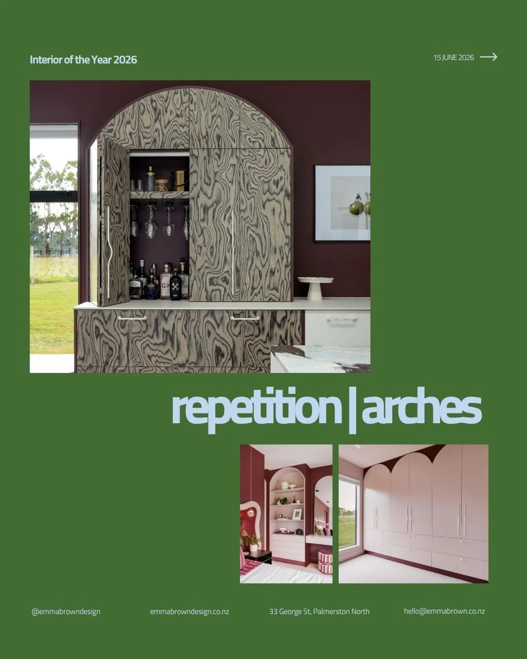
The divider panels, the wavy cabinetry handles and then, of course, the burgundy arched bar.
The moment that almost didn’t happen.
Designed to feel more like a piece of furniture than built-in cabinetry, the lacquered two-tone plywood veneer brings all the personality into the space.
And yes... before you ask.
The burgundy was always the plan.
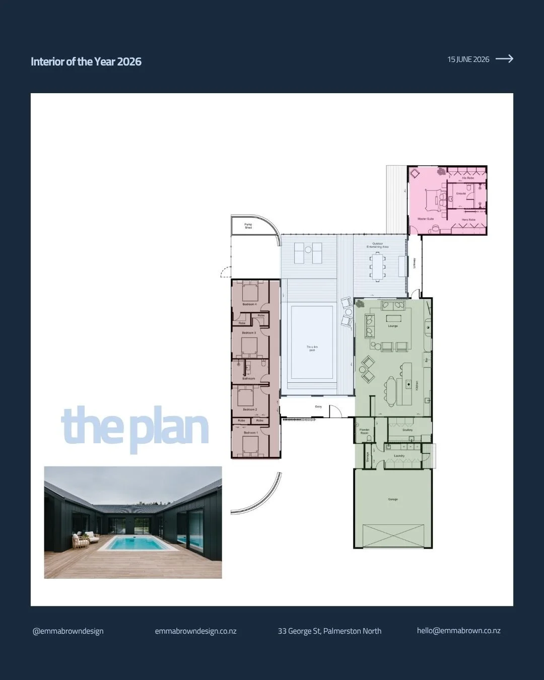
The Plan
This home wasn’t about squeezing the most rooms possible into the biggest floor plan.
It was about creating a home that actually worked.
The biggest part of the brief was connection. The pool became the anchor point of the design, with the living spaces wrapping around it so there is always a visual link between inside and out.
For a blended family with teenagers, this was a big one.
Because family life is a funny balance, isn’t it?
You want everyone together... but also enough space that everyone can disappear when they’ve had enough of each other. (Teenagers especially.)
The home needed spaces to entertain, spaces to retreat and spaces that naturally bring everyone back together without feeling forced.
It’s one of those things you don’t always notice when a home is designed well. You just know it feels right.
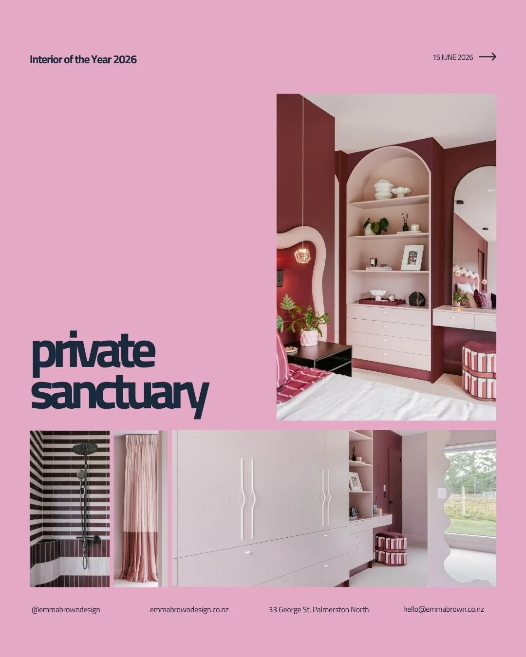
Private Sanctuary
Now this room...
This is where we get to slow things down.
While the rest of the home is full of colour, movement and personality, the master suite was designed to feel like a calm little escape from the beautiful chaos happening everywhere else.
Rich textures, soft curves and layers of detail create a space that feels refined but still connected to the rest of the home.
But of course, we couldn’t leave it completely sensible.
The burgundy and pink bathroom tiles were one of those moments where we knew we needed to do it.
Did the tiler question the pattern? Absolutely.
Did he reach for the calculator and wish he had stayed in math class longer? Maybe.
The curved shower plinths became a perfect example of turning something practical into something beautiful. Because why shouldn’t your shampoo bottles have a nice place to live?
The arched wardrobes were designed around Emma’s love of clothing, creating storage that feels intentional rather than just somewhere to throw things.
Anton's wardrobe? Let’s just say his clothes (the piles on the floor next to the wardrobe) have a much quieter home.
Custom details continue throughout, from the fluted makeup stool upholstered in Anna Sassi fabric to the bespoke wavy headboard by Classic Upholstery.
This isn’t just a bedroom.
It’s the exhale at the end of the day.
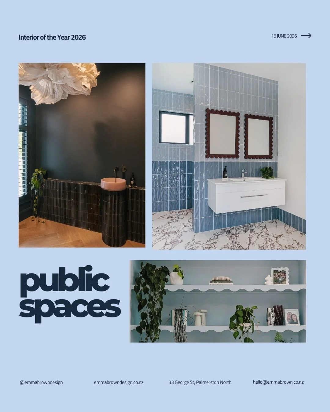
Public Spaces
These spaces had one big job. To keep up.
This home needed to handle Friday night drinks, teenagers taking over the lounge, Christmas lunch and a quiet Tuesday night all equally well.
Because pretty is great...
But pretty and practical? That’s the sweet spot.
Every material choice had to work hard. Every detail needed a reason to be there.
The pink floating hearth was one of those moments we saw and instantly knew it had to happen.
The large curved fireplace doesn’t just sit against the wall doing its job quietly; it becomes a sculptural element in the room.
The blue undulating bookshelf was another favourite. Not only does it add movement, but it creates a home for the things that actually make a house feel lived in; books, artwork, treasures and pieces collected along the way.
The burgundy rug grounds the room, skylights bring beautiful natural light through the space, and the blue ric-rac curtain edging adds that little unexpected detail that makes you smile.
Repetition: The Details That Tie It All Together
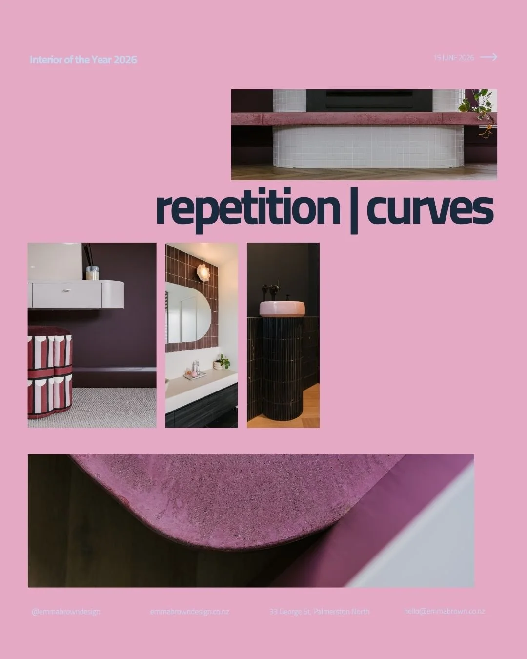
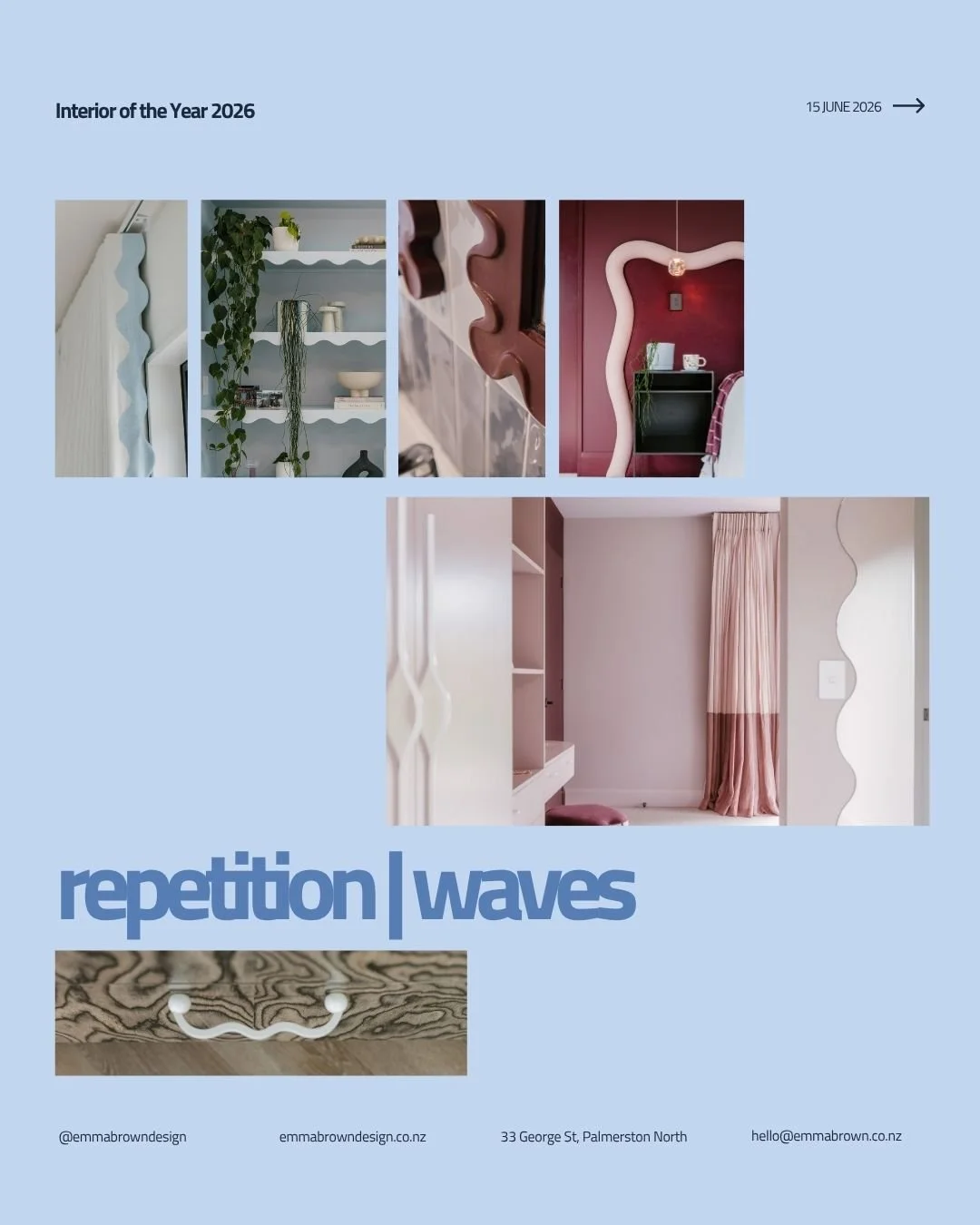
One curve would have looked accidental. One wave might have just been a fun detail. One arch could have simply been a pretty shape.
But when you start repeating those elements throughout a home, something interesting happens...
They become part of the story.
This was one of our favourite parts of designing A Sculpted Gathering, creating little moments that speak to each other without making the house feel like it’s been copied and pasted.
Curves appear throughout the home in the joinery, furniture, fireplace and architectural details, softening the stronger lines of the building and creating a sense of flow.
These moments add movement and personality, appearing in details like the cabinetry handles and shelving. They take everyday elements and make them feel a little more special.
The trick with repetition is knowing when to stop.
You don’t want to walk into a room and think, “ah yes... another arch.”
(We promise we showed some restraint.)
It’s about creating those subtle connections that your brain notices before you even realise why the home feels so cohesive.
That’s the magic of good design.
Make it stand out
The Why
This house was always going to test an idea: can thoughtful design create a high-end feeling home without relying on luxury materials? Heck yes!
Because luxury isn’t always about the price tag. It’s about knowing where to invest, where to simplify and where to push the design further.
Standard cabinetry was elevated through clever detailing, off-the-shelf products were given personality, discounted tiles became a feature and simple paint choices helped create moments of impact.
The magic wasn’t in spending more. It was in making every decision count.
And perhaps our favourite lesson from the whole project?
Even when your client knows a thing or two about design... they should still listen to their designers.
