

Stop decorating every corner
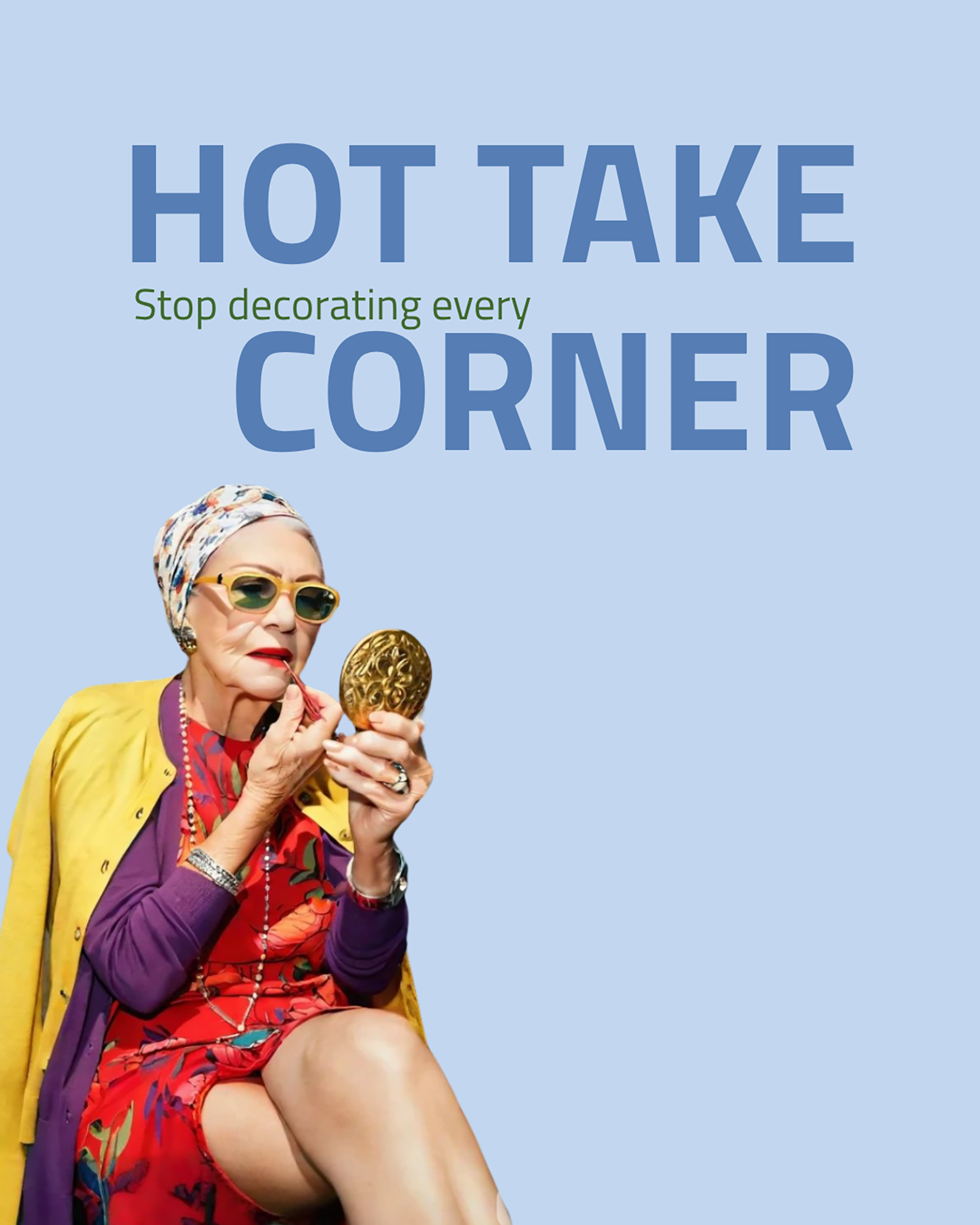
Somewhere along the way, interior design became a sport.
How many things can you fit on a shelf?
How many textures can you layer?
How many plants until the room feels alive?
How much until the room feels like it is trying too hard?
We are calling time on that.
This series is for the people who are tired of feeling like their home is never quite finished, never quite styled enough, never quite Instagram-ready. Because here is what nobody is saying loudly enough: the most confident spaces in the world are the ones that know when to stop. They are edited, intentional and comfortable in their own skin.
Design that lets you actually live in it rather than around it.
This is not minimalism for minimalism's sake. We are not asking you to throw everything out and sit on a concrete floor. We are asking you to consider that the things you love deserve space to be loved properly, and that every surface you leave alone is a gift to your nervous system.
Design less, live more and your home will thank you!

Less can be more!
That long, glorious stretch of table with nothing on it?
That is not a styling oversight.
That is a designer decision.
We live in a world that tells you every surface needs an object, every corner needs a plant, every shelf needs a vignette.
It is exhausting and, honestly, it is wrong. Negative space is what makes the things you DO love actually land.
That ornate ceiling, the pendant, the beauty of the timber, they are all fighting for your attention and the empty table is the thing that lets them win.
Restraint is not boring.
Restraint is confident.
Breathe and let go…
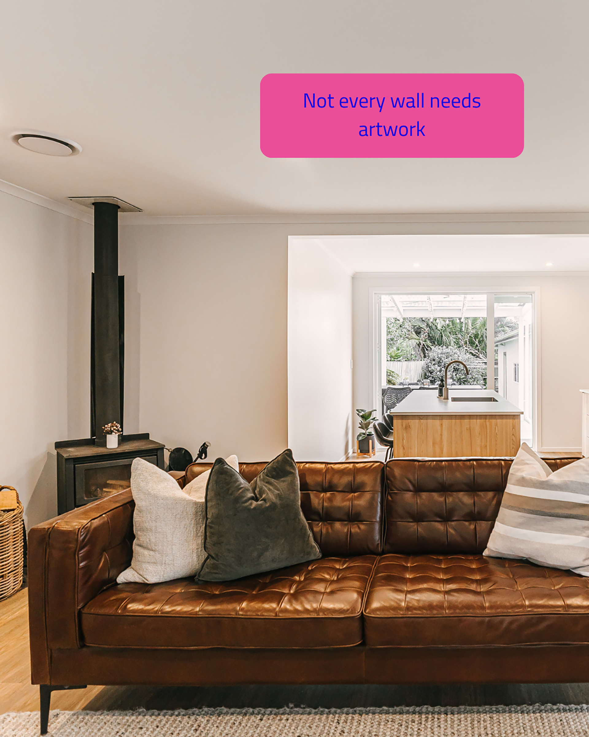
Here is a radical idea: what if the wall just... breathed?
That warm leather sofa,
the wood burner doing its thing,
the layered cushions telling their own little story.
The wall above it does not need to perform, it is already part of a room that feels settled and complete. The pressure to fill every vertical surface with something comes from the same place as the pressure to fill every silence in a conversation.
Some walls are meant to hold space, not steal it.
Let them.
Let the design do the talking
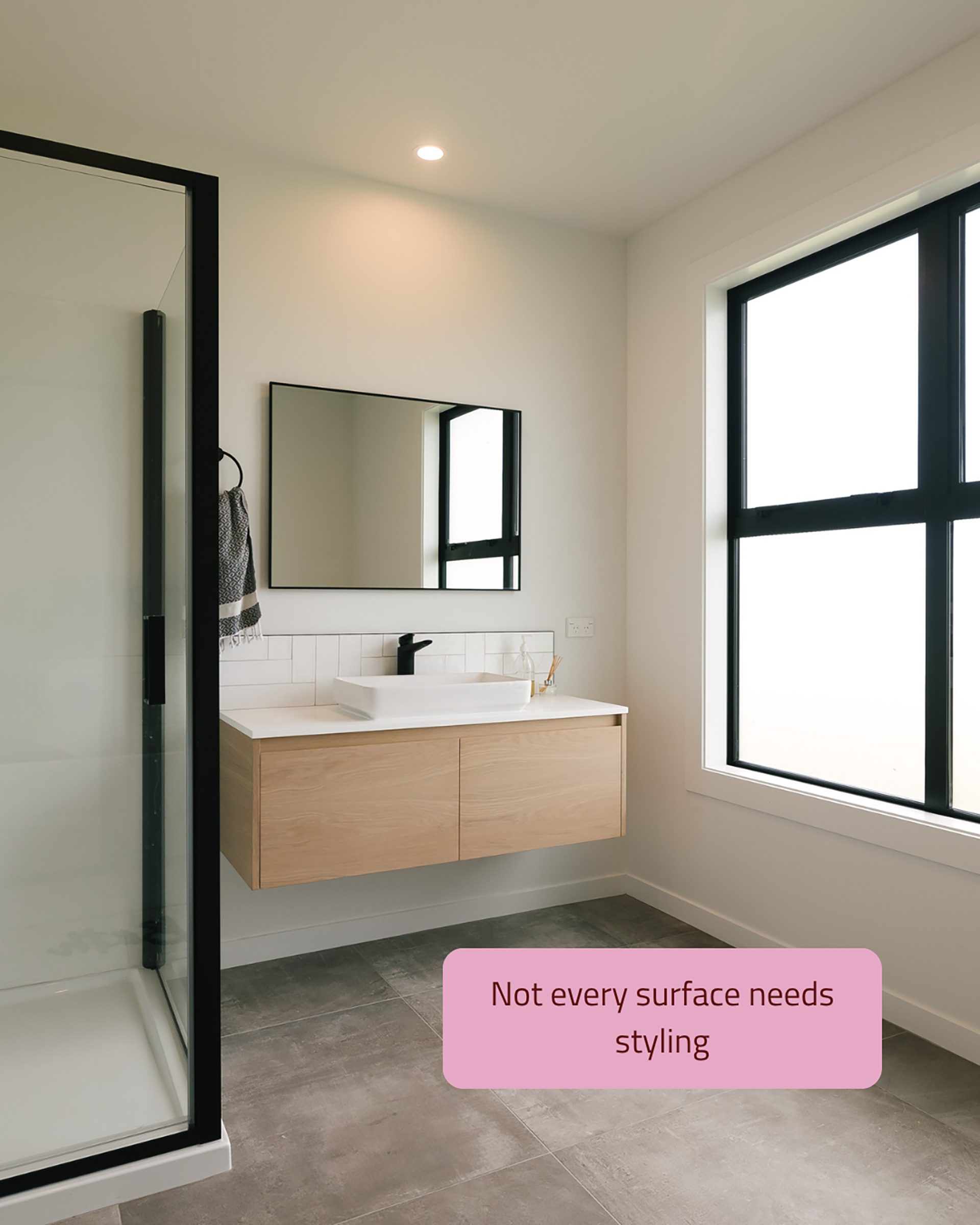
A beautiful vanity.
A thoughtful tile.
Good proportions.
A window doing exactly what windows are supposed to do and nothing on the counter pretending to be a still life.
This bathroom does not need a stack of linen towels and a small arrangement of dried botanicals to be finished.
It already is finished.
There is a kind of confidence in a space that knows it does not need to try harder than it already has.
Clear surfaces are not empty. They are edited. There is a difference and it is everything.
Too much noise can break the room…
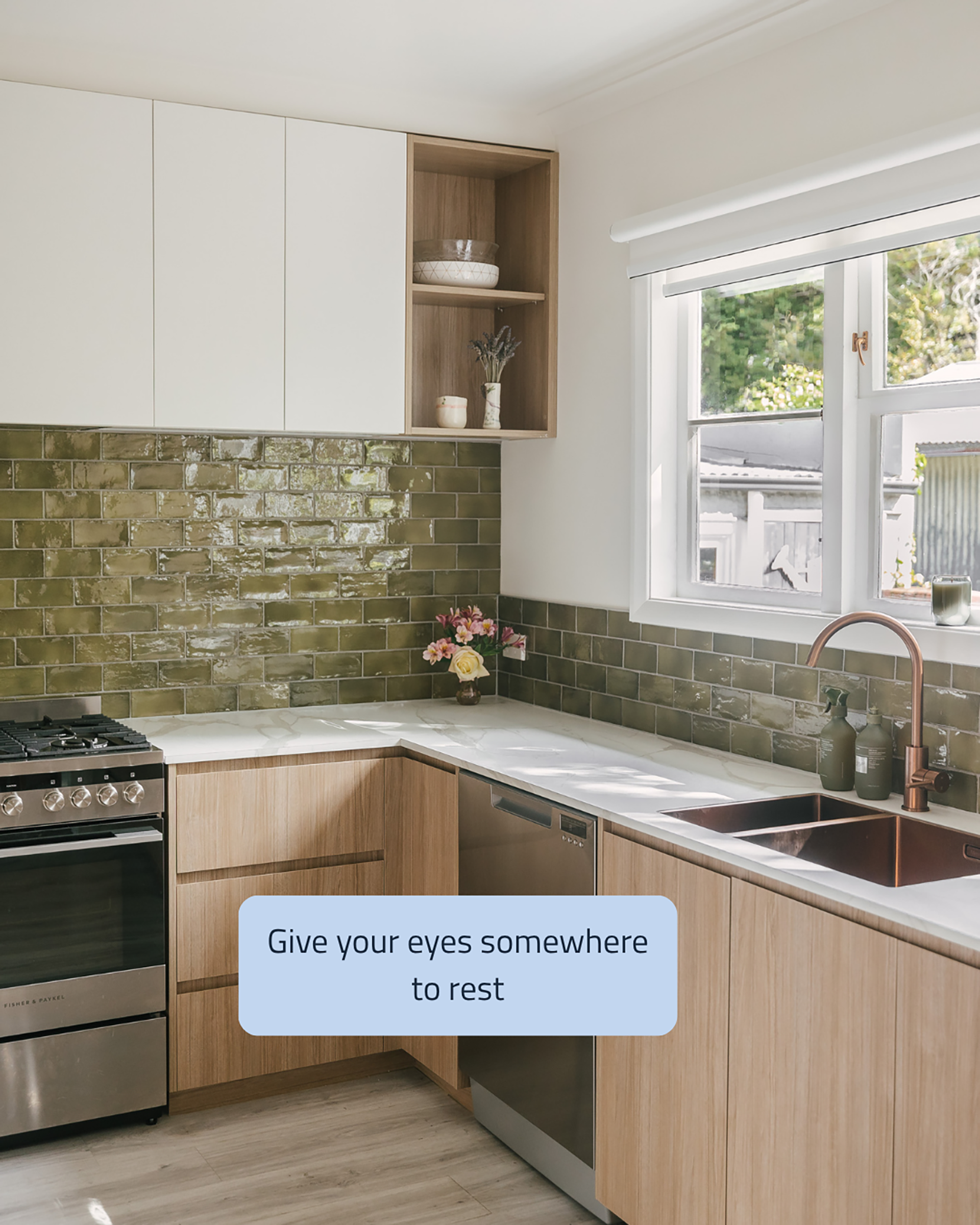
Look at that splashback. Go on, really look at it.
Those olive green glazed bricks with their depth and variation and that quiet copper glow coming off the tapware.
Now imagine if every single surface in this kitchen was also doing something.
The floor, the benchtop, the cabinetry, all competing for the top spot.
You would be exhausted before you even made your coffee.
The brilliance of this space is the deliberate calm in the lower cabinetry that lets the hero tile be exactly that!
