

The secret to using neutrals without ending up with a boring house
Somewhere along the way, neutral interiors got a bit of a bad reputation.
Somewhere along the way, neutral interiors got a bit of a bad reputation.
People hear "neutral" and immediately think beige, builder's white, no personality, and a house that somehow feels both expensive and a little bit... sleepy.
But here's the thing—we actually love a neutral palette.
Done well, it's timeless, calming and lets beautiful materials do the talking. Done badly... well... it can end up looking like someone accidentally turned the saturation down on your entire house.
So if you're dreaming of a neutral home without it feeling flat, here are a few tricks we use all the time.
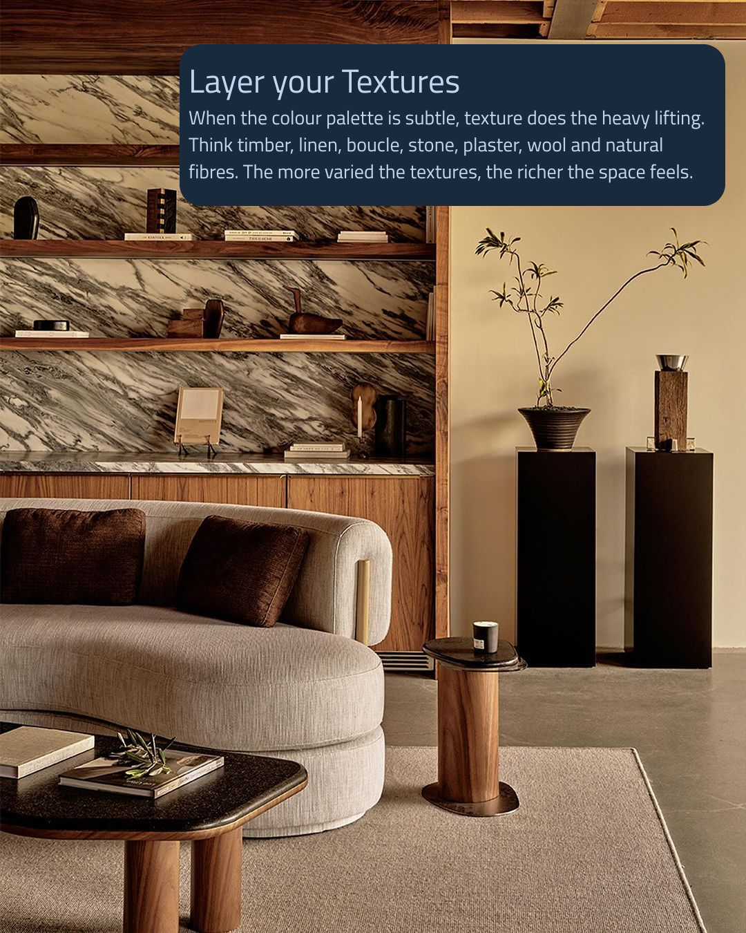
Texture is your best friend.
If you're taking colour away, something else has to step up.
That's where texture comes in.
Think soft linen curtains, chunky wool rugs, warm timber, natural stone, plaster finishes, boucle chairs, woven baskets and beautiful ceramics. Every material catches the light differently, which instantly creates depth.
A room with ten shades of beige sounds terrible.
A room with timber, linen, stone, wool and plaster? That's a completely different story.
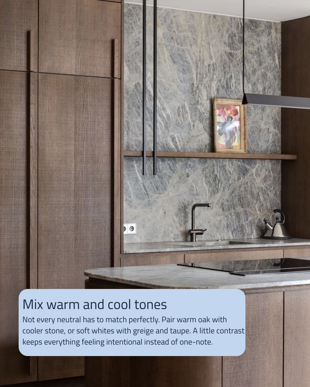
Not every neutral has to match.
One of the biggest mistakes we see is people trying to make every neutral exactly the same tone.
The sofa matches the walls.
The walls match the flooring.
The flooring matches the curtains.
Before you know it, everything blends together.
Instead, mix warm and cool tones. Pair an oak timber floor with a cooler stone benchtop. Layer warm whites with greige, taupe or mushroom tones. Those subtle shifts are what make a space feel considered rather than accidental.
Think of it less as matching and more as collecting.
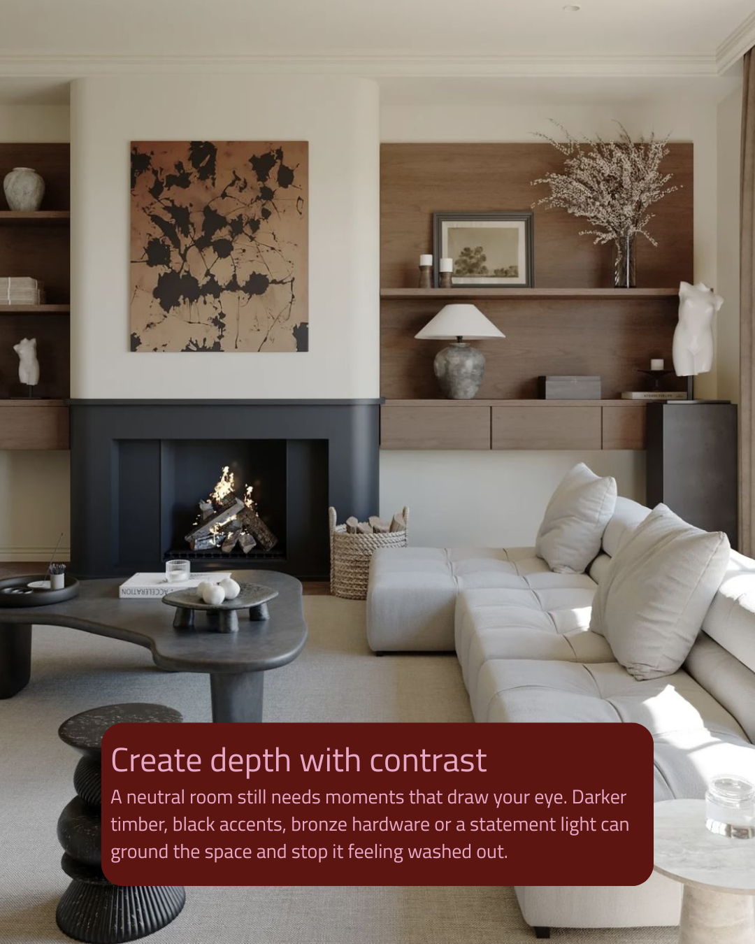
Every room needs a little drama.
Yes... even the calm ones.
A neutral space still needs somewhere for your eye to land.
That could be darker timber joinery, a bronze tap, black window frames, oversized artwork or a statement pendant that steals the show.
It's a bit like seasoning your dinner.
Without a little contrast, everything tastes the same.
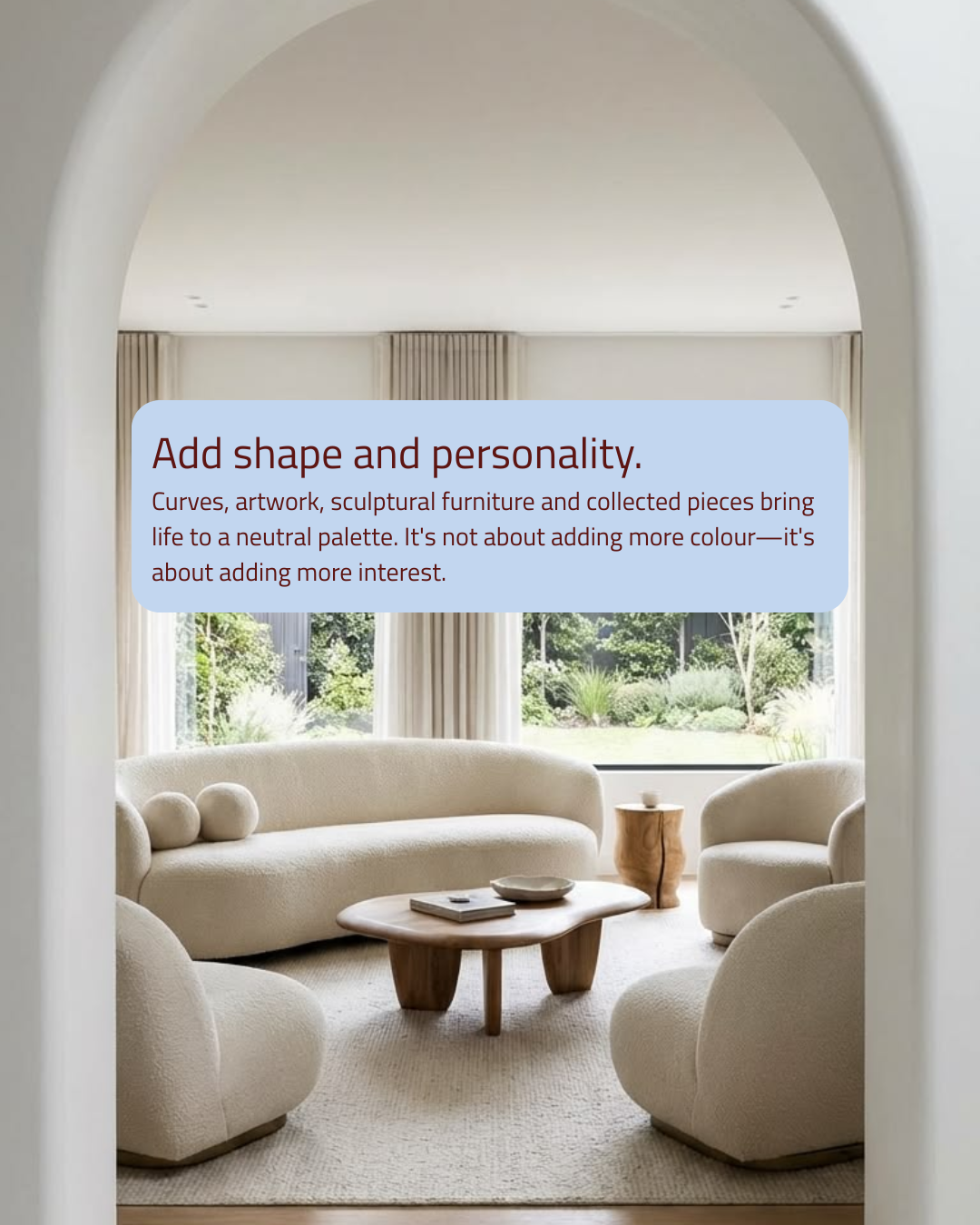
Shape matters more than you think.
If everything is the same colour, your furniture and styling have to work harder.
This is where curves, sculptural furniture, interesting lighting and oversized artwork become your secret weapon.
A beautifully shaped chair is suddenly the feature.
A wavy lamp becomes a conversation starter.
A chunky coffee table suddenly has its moment.
The colour palette might be quiet, but the room certainly isn't.
And finally... don't be afraid of personality.
Neutral doesn't mean minimalist.
Display the ceramics you collected on holiday. Stack the coffee table books you actually read. Add the quirky artwork that makes you smile every time you walk past it.
The best neutral homes don't feel like a showroom.
They feel like the people who live there.
Because the goal isn't to create a house that's all one colour.
It's to create a home with enough layers, texture and personality that nobody even notices the colour palette in the first place.
